
Mobile-First Indexing and the Rise of Online Browsing
Picture this: you’re browsing on your mobile phone to search for a certain product. Google gives you a list of websites that offer the product you need. You open one of the websites and as it loads, you have to pinch and zoom just to see the item you need and its price. If it’s not that, you can’t zoom the page at all and your fingers find it hard to press very small buttons. You might even click the wrong button and end up buying or subscribing by accident. All in all, it takes a lot of time and you decide to exit the page and find another website. If you were the owner of that site, you just lost a potential customer. This is why being mobile responsive and mobile-friendly is an important factor to consider for businesses and companies with websites and Google is utilizing mobile-first indexing.
The Rise of Mobile Browsing
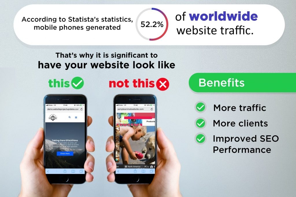
As of June 2018, Statista’s statistics show that mobile phones generated 52.2% of worldwide website traffic. This is an increase from last year’s 50.3%. This isn’t exactly shocking since a lot of electronic brands are continuously developing smartphones. The internet is also readily accessed with the help of WIFI and data connectivity. It’s also understandable why people are starting to prefer mobile phones for internet browsing. It can be done anytime and anywhere. You don’t need to open your PC or your laptop and wait for it to startup just to search for something on the internet. You can also easily save and download data and photos on your phone which you can open anywhere, whatever time you want. Plus, the smartphone is also significantly smaller than a laptop and easier to carry with you compared to an entire PC set.
In lieu of this increasing trend in mobile browsing, Google has announced last March 26, 2018 that they’ve started migrating sites that adhere to the best practices for mobile-first indexing.
But what is mobile-first indexing?
Mobile-First Indexing
Google’s ranking, indexing, and crawling systems typically use a page’s desktop version. But with mobile-first indexing, Google will now utilize the page’s mobile version for indexing and ranking. This will better help users easily find what they need on the search engine when they are browsing on their mobile. This means if you’re using your smartphone to search for something on Google, the results will first display results that are mobile responsive and mobile-friendly. This saves you a lot of time from opening multiple tabs and choosing which is mobile-friendly.
Google will also be incorporating a lot of updates and changes in line with this. Sites that will be migrating to mobile-first indexing will be notified by Google through Search Console. Google will also be showing the pages’ mobile versions in search results and cached pages.
A Call to Webmasters
This may come off as quite alarming to sites that are not mobile-friendly. However, Google says there is no need for these sites owners and admins to panic. Google’s mobile-first indexing is not about content ranking but rather, is about content gathering. Additionally, sites that only have desktop content will still continue to be represented in Google’s index.
Furthermore, it’s also possible for a site to have higher rankings on desktop but lower on the mobile.
But while these sites have no reason to panic, Google still encourages webmasters to make their pages and content mobile responsive and mobile-friendly. This is because they continue to evaluate all contents in their index to determine a page’s mobile-friendliness.
Then again, this does not necessarily mean that website owners should start abandoning their desktop website. There is still a notable 43% of users who use the desktop when browsing. There are also people who do prefer the larger screen of their desktops when viewing and reading a website, but that still doesn’t change the importance of mobile-first indexing.
Mobile Website VS. Desktop Website
A mobile website is specially designed to remain functional and visually appealing even on a smaller screen. Hence, its images, letters, and buttons are definitely bigger and easier to touch and click. On the other hand, a desktop website’s scale is for a much larger screen. Its images, letters, and other elements are smaller as they can easily be seen on a large screen.
Hence, it’s incredibly important for websites to have both desktop-friendly and mobile-friendly sites. This adaptability to whatever device, called responsiveness, is what Google is aiming for a lot of business websites.
More Time To Change
As per usual, Google is careful in implementing changes and updates and doesn’t dive into things straight away. Moreover, smartphones are becoming better and faster and a lot of establishments and homes are already Wi-Fi zones. All of things point to a single direction though and that is for websites to become more mobile responsive and mobile-friendly. For a website to become responsive on both desktop and mobile, site owners can seek assistance from web developers and web designers. There are a lot of IT companies in the Philippines that specialize in web developing and designing who are capable of making your website rank high on both desktop and mobile indexes.
About Adam Tan
Adam is a charming geek who loves his family's Siberian Husky, enjoys the occasional night out with friends and, most of all, lives and breathes new trends and updates about the web and its technicalities. If you want to stay updated with changes or new trends on the web or learn about the technicalities that are involved, he's your guy. He's capable of writing cheesy stuff as well, but he'd rather stick with the manly stuff.
- Find more about me on:


Related News:

Facebook Ads Formats for Your E-Commerce Business

Use of Accounting Software

Dedicated Virtual Assistants: The Whole Nine Yards

Fitness Website Design Recommendations and Ideas

Why You Need a Pinterest Virtual Assistant


Comment 0