
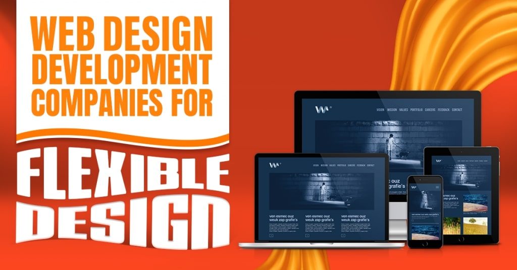
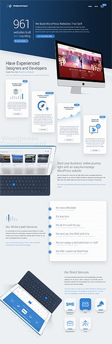
Web Design Development Companies for Flexible Designs
Whether they are on their desktop, laptop, or smartphone, web design development companies ensure that your website can quickly adapt and deliver the best user experience.
How do they do this? Through flexible or responsive web design and development in the Philippines.
The Idea Behind Responsive Design
Creating websites that can adapt to the different screen sizes without compromising usability and user experience is the primary purpose of responsive design. Among the many advantages of responsive design, it lets text, UI elements, and graphics be rescaled and resized depending on the viewport.
Responsive design is not tied to a particular device. Web design and development experts do this by writing a single set of HTML, CSS, and JavaScript code for multiple devices, platforms, and browsers.

Designed by Freepik
A Briefer on How Responsive Design Evolved
Most users had access to one browser during the late 1990s. Do you have any idea which browser this is? You got that right. It was Internet Explorer. By then, people have been using one device (computer desktop) with screen sizes that were more or less consistent everywhere around the planet. Thus, during that time, the many browser engines, platforms, and devices we have today were not factored in in web design.
In time, people invented various devices with different screen sizes. So, web design development companies started creating components whose dimensions match in percentages relative to the viewport.
In 2010, Ethan Marcotte changed the way web developers approached web design when he pointed out how users access the web through different devices. He talked about how various screen sizes, orientations, and browsers to consider when designing. He also emphasized how you can use multiple modes of interaction while creating content for said websites.
The heads up was a good thing. By 2016, mobile browsing overtook web browsing, which brought emphasis to the need of considering mobile-first when it came to web design and development.
At present, the market has a seemingly endless number of mobile devices for users to choose from, and these devices have their dimensions and graphics processing capabilities. In the Philippines alone, it is a challenge that Filipino web designers gladly meet and do well to overcome.
How Responsive Web Design Works
You can ensure responsive web design through the use of Cascading Style Sheets (CSS). Web design companies that offer responsive web design services in the Philippines employ CSS with settings that cater to different style properties dependent on a device’s screen size, orientation, color capability, resolution, etc. Such flexible design features include viewport and media queries.
Why Responsive Web Design Matters
Simply, responsive designing prevents web design development companies, user interface designers, and other web developers from creating websites for every single type of device around. Some of flexible and responsive design’s many advantages include a website configured for the user’s optimal viewing pleasure. Responsive web design and development in the Philippines also scale images, fonts, and other HTML elements on your website to whatever screen size the user has. More importantly, users will no longer need to redirect your site to access the content as quickly as possible.
Responsive Design Checklist
In this section of the article, we will be discussing a few things that web design development companies consider to ensure that your website provides the best possible experience for its users, no matter the device that they are using.
Before we begin, however, here are some signs that mean your website is probably not responsive and does not employ flexible design:
- You did not align photos accurately.
- The text is too small to read.
- You find it hard to click on navigation bar elements.
- When filling out a form, it stays small, and you zoom in on it manually for you to fill it out.
- You can scroll the page left to right and vice versa.
On the other hand, if you observe the following on your site, it is likely to be responsive:
- Text sections fill up the page.
- Design modules are appropriately aligned and easy to digest
- There’s no need to zoom in to read the menu.
- Navigation bars take the form of a hamburger menu until clicked upon and expanded.
- Forms are easy to fill out as they expand to fill the page.
Read through the following checklist for you to have a professional and responsive website.
-
Test your site.
Testing your current site is one way to check if it is responsive or not. Web design development companies often use a variety of responsive design test tools. These tools provide insight into how your website looks on different devices. If your website looks the same on smaller devices as it does on your desktop, then it has a flexible design and is responsive.
-
Fix unresponsive elements.
Upon knowing which site elements are not flexible or responsive, find ways to fix them. Elements, especially the following, may need responsiveness checking: images, fonts, navigation bar, forms, and buttons. Make sure that they respond well to improve user experience.
-
Test site speed.
When providing an excellent user experience, page speed is a crucial factor. Web design development companies test your site speed on various devices to see if they load quickly. Otherwise, you run the risk of users bouncing from your site. Make sure that it loads in three seconds or less regardless of what device they are using. Check if you condensed the images. There could be cluttered code, so fix that. Placing too many heavy elements, such as videos on your page, can also contribute to your page’s loading speed.
-
Consider finger taps.
Smartphone users tap with their fingers. Tablet users may be tapping with their stylus pens. In the web design and development process, consider your site elements while thinking about the different tapping devices a site visitor may use. Are the buttons big enough for a stylus or fingertips? Will users find the menus easy to tap on any device? Are forms easy to fill out with either finger taps or styluses?
-
Test your navigation.
The navigation menu is a roadmap for users to find what they are looking for on your site. So, make sure that yours works properly. In the Philippines, most mobile-friendly designs made by a Filipino web designer choose to have navigation menus hamburger-style instead of having it span along the top of the page. Doing so keeps the users from having to zoom in to see the options.
-
Make pop-ups responsive.
A pop-up is one way for you to provide your users with an invitation or a special offer. These pop-ups may appear once they reach the bottom of a page, click on a specific link, or stay on the home page for a specified period. Web design services primarily in the Philippines make sure that these pop-ups are responsive. As a result, users on any device will not find it difficult to click and sign up.
-
Ensure visual appeal.
Your site should remain visually appealing on all kinds of devices. Web design development companies are experts in innovating and reinventing websites such that its elements are mixed, arranged, and presented in the most effective and visually appealing way. Sites specifically designed for desktop should also look right when viewed on smartphones and tablets. Make sure that images do not take up the whole screen and format their descriptions correctly. Check if menus are not cut off, and organize forms and tables effectively. See to it that you rendered bulleted lists and service lists accurately. Make sure that you arranged shopping carts for easy use.
-
Be the site visitor.
At this stage, you will have to audit your efforts by visiting the site yourself. Check on all the elements to ensure that you did not miss anything. Try submitting a form or purchasing a product. Test the navigation bar links if they work correctly. Go through your blog and product pages to see if they look alright. Experiencing yourself what your customers will experience is one way to ensure that you did not forget anything from this web design checklist.

Designed by Freepik
Avail of Web Design Services in the Philippines
As a crucial part of your online presence and company success, make sure that your site employs a flexible design. By this, you will know that it is entirely responsive to users.
If you find that you still need help creating a flexible or responsive website, even after following the above checklist, you can hire a web development company in the Philippines for your business needs. Ensure responsive design and the best user experience through web design and development!
About Adam Tan
Adam is a charming geek who loves his family's Siberian Husky, enjoys the occasional night out with friends and, most of all, lives and breathes new trends and updates about the web and its technicalities. If you want to stay updated with changes or new trends on the web or learn about the technicalities that are involved, he's your guy. He's capable of writing cheesy stuff as well, but he'd rather stick with the manly stuff.
- Find more about me on:


Related News:

What are Rental Receivable Monitoring Systems?


Comment 0