
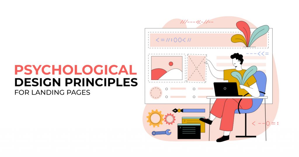
Psychological Design Principles for Landing Pages
Business websites need organized, functional, and aesthetically-pleasing landing pages to guarantee a positive page experience for site visitors. As such, website owners must research their target market to know how their websites should look. However, as a general rule, we will discuss some of the widely used psychological design principles that site owners can implement in their web design and development for improved landing pages.
Widely Used Psychological Design Principles for Web Pages
Visual Hierarchy
This psychological design principle focuses on order and how the human eye sees or perceives said order. Since certain parts of your landing page are more important than others, you should place more emphasis on those and less on the rest through your web design.
To do this, you can play with size: the more critical the web element, the bigger its size. You can also make use of color. More important web elements should have more eye-catching colors so that they stand out on the page. See visual hierarchy employed in the image below:
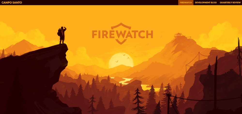
Image Source: Firewatch
The first thing you will notice here is the word “Firewatch” right in the middle of the page. Then, our eyes scan over the contrasting colors of the dark foreground and the lighter-colored background. The foreground highlights the silhouette of a man standing on the edge of a cliff. The lighter-colored background shows a valley, a mountain, and the horizon beyond. We then see the header, which states the title of the page on the left and the menu on the right. This is how you can use visual hierarchy to have improved landing pages.
The Golden Ratio
Now that more and more people use mobile devices, your website should have a responsive design to ensure that anyone can access it using whatever device. This means that your website should adapt a layout that flows and adjusts according to the size and resolution of the device. For this, you can integrate the concept of the Golden Ratio (equal to 1.618), another psychological design principle that helps create aesthetically-pleasing designs. The golden ratio has been used by many artists and architects over the centuries. It basically looks like this:
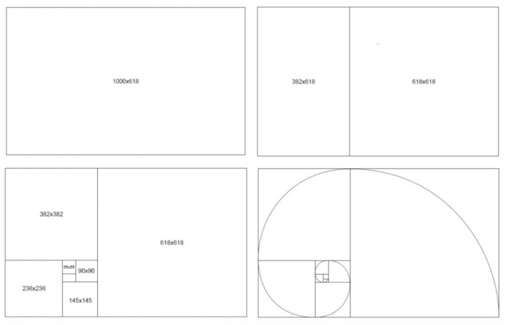
Image Source: Company Folders
These proportions can serve as guides when creating your responsive web designs. You can do this by creating columns and proportional layouts. The layout you see below with a main content area and a sidebar follows the golden ratio.
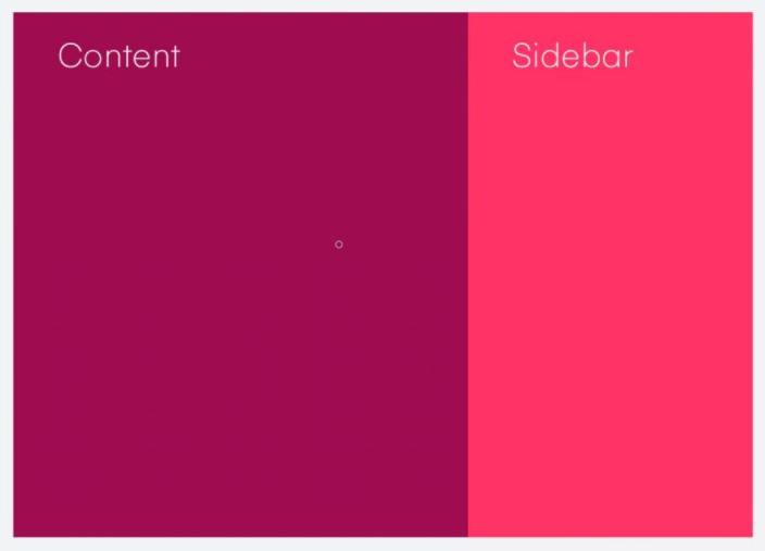
Image Source: InVision
Below, we see the golden ratio in action on a web page design.
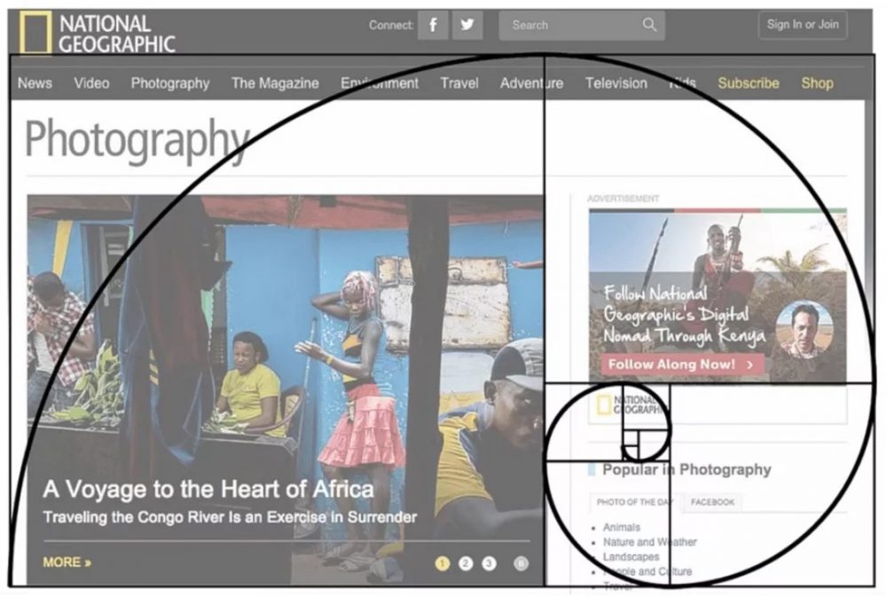
Image Source: Apium Hub
You can use the golden ratio to design your typography, the grid or layout, and the composition of your website’s graphical elements.
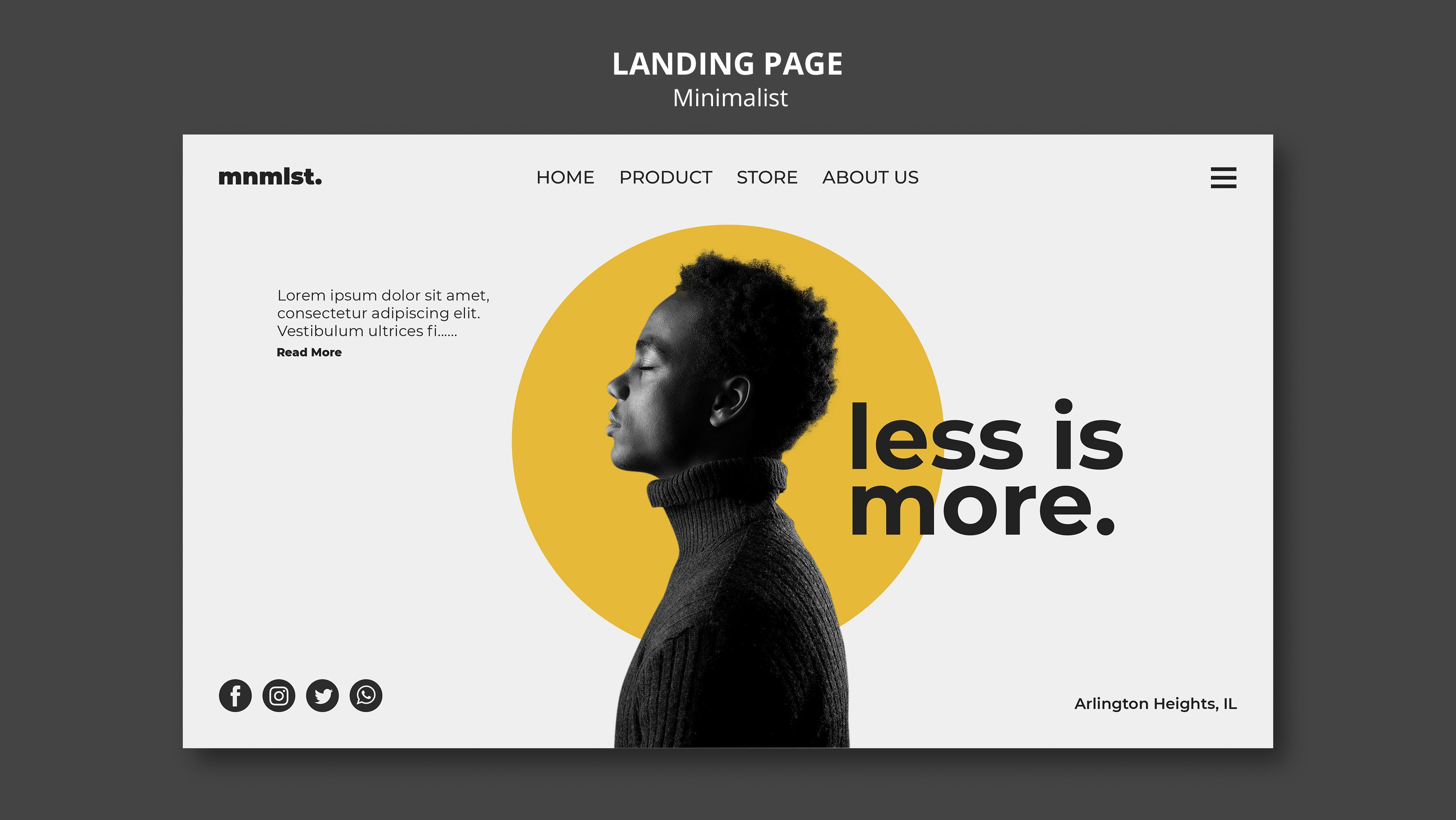
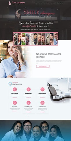
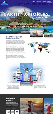
Jakob’s Law
The law was coined by Jakob Nielsen of the Nielsen Norman Group, a well-known UX research institute. According to this particular psychological design principle, people spend a lot of their time on other websites; thus, they are already accustomed to specific design patterns. So, he suggests that you should also apply these design patterns for improved landing pages. As a result, site users will have a familiar and positive page experience.
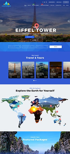
Usually, you will find the company’s logo on the top left of the page, followed by the navigation bar. Towards the top right-hand corner, you will see the area for the log-in and sign-up buttons. Often, these buttons have a search bar beside them, which comes in handy, especially for users who already know what they are looking for on that site.
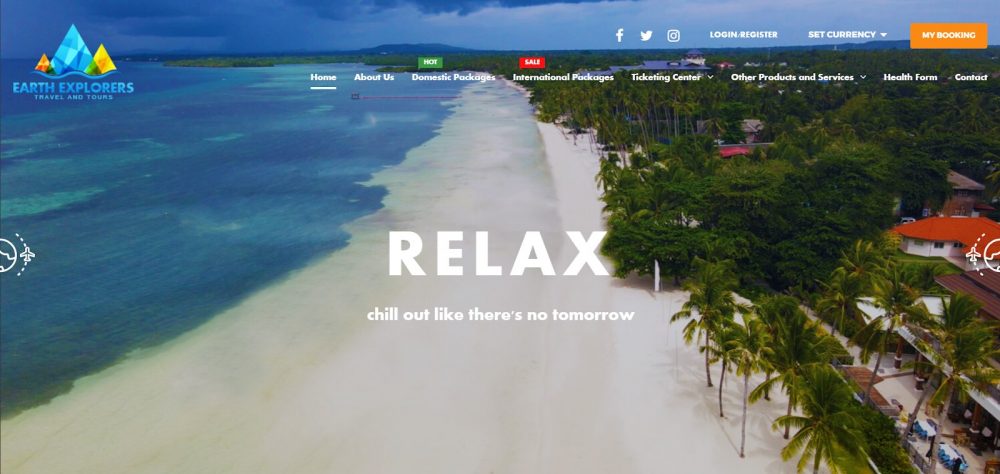
Image Source: Earth Explorers
Moreover, for your website’s mobile version, you can make use of a hamburger menu, which is usually composed of three horizontal lines that are already quite understood by most site users.
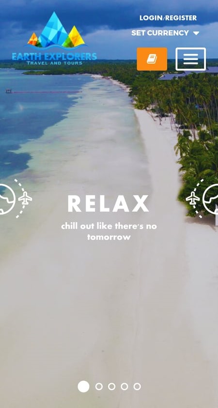
Image Source: Earth Explorers
Then, with regards to your text and images’ layout, you should keep in mind that Latin languages follow the left-to-right reading direction. So, place your text aligned to the left and its accompanying image or video towards its right. In the case of mobile view, the image or video can come after the text.
Also, according to Jakob’s Law, people already expect to find specific features at a certain place and function in a particular way. So, when designing your landing page, keep in mind that site visitors usually scan a page following a Z-pattern. They start looking from the upper left corner and then proceed to the upper right. After that, they look towards the lower-left corner and then end up on the lower right.
Hick’s Law
According to Hick’s Law, the more choices users have, the longer it would take for them to reach a final decision. So, it would be best if you kept things short and simple. For your landing page’s web design, try to focus on one goal instead of putting as much information as you can. By limiting your user’s choices, you help them by relieving them of their anxiety to make a choice. Don’t worry about your other products because, later on, you can create more landing pages that are also built for a single purpose.
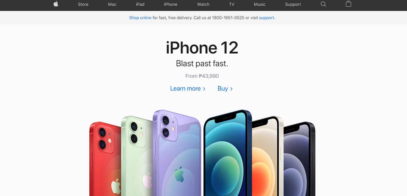
Image Source: Apple Philippines
Following this psychological design principle, you can also make use of progressive disclosure in displaying information. You can do this by sequencing information across several pages or screens. If you do this, you will have simple, clean-looking, and improved landing pages. So, you can place the essential information on your landing page, such as your main products or services. Then place a one-sentence description about your products, with a link that would lead them to another dedicated landing page should they want to know more.
Pareto Principle
Not all of your site visitors would scroll all the way down on your website. Most times, they’ll be spending it above the fold. Thus, to get improved landing pages, this is where you should place most of your web design efforts. The Pareto Principle tells us that we need to focus our efforts on things that generate the most value for us.
So, if you have many products, this psychological design principle suggests that you should place the most likely choices on top. You no longer need to place everything as it will only make your landing pages crowded. Moreover, you can also prioritize features depending on how much traffic or requests you get regarding them from your site visitors.
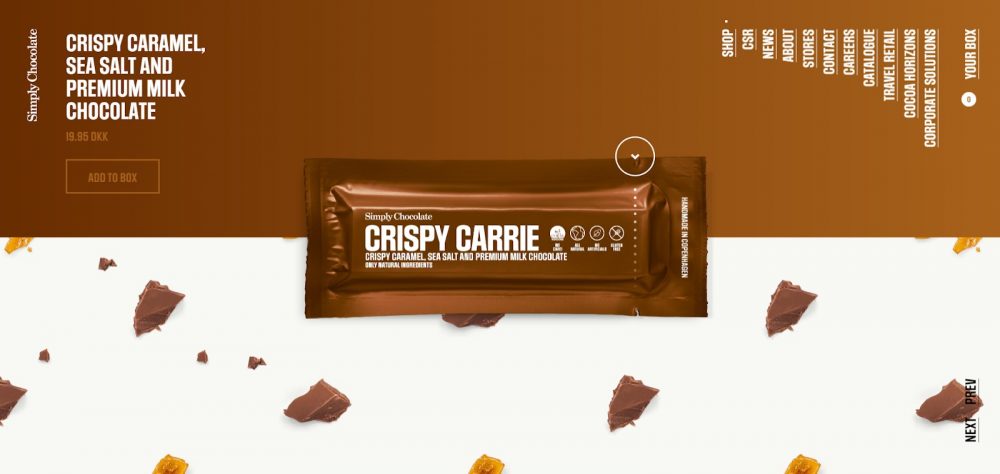
Image Source: Simply Chocolate
Then, you also have to consider what your site users should see first on your landing page in terms of mobile viewing. It all depends on what you expect them to do on your site. Thus, you don’t always have to replicate what you did for your desktop website version on your mobile website version. For instance, you may highlight your log-in and sign-up buttons on the desktop version; however, for your mobile version, you can highlight your pricing or CTA instead.
Social Proof
Under social psychology, people are influenced or persuaded to take action based on what they see from other people. When people think that other people’s actions are worth following, then they do so as well. We are more likely to take action when we see other people doing it, too.
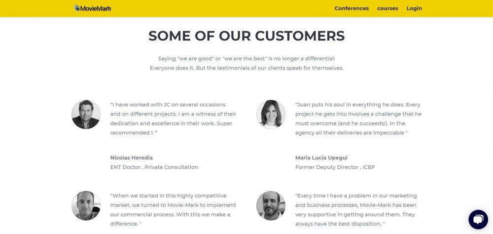
Image Source: Movie Mark
As such, you can have an improved landing page by using the psychological principle of social proof to show your business competence and quality. On your landing page, you can place reviews from experts or social media influencers. You can also place pictures of real people who were satisfied by using your products or services.
With these social proofs, site visitors will know that your brand can be trusted. You also encourage them to purchase your products or avail of your services.
Image Source: Freepik
Build Improved Landing Pages Now
Creating effective landing pages and business websites requires a lot of dedication and skill. Thankfully, you can design and build improved landing pages with the help of a web design and development company by applying the psychological design principles mentioned above. Which of these six principles of psychology for web design are you most excited to use on your site?
About Adam Tan
Adam is a charming geek who loves his family's Siberian Husky, enjoys the occasional night out with friends and, most of all, lives and breathes new trends and updates about the web and its technicalities. If you want to stay updated with changes or new trends on the web or learn about the technicalities that are involved, he's your guy. He's capable of writing cheesy stuff as well, but he'd rather stick with the manly stuff.
- Find more about me on:


Related News:


Custom Websites over WordPress: When to Choose

Choosing the Right Social Media Platform

Restaurant Management Software for Your Business


Comment 0