
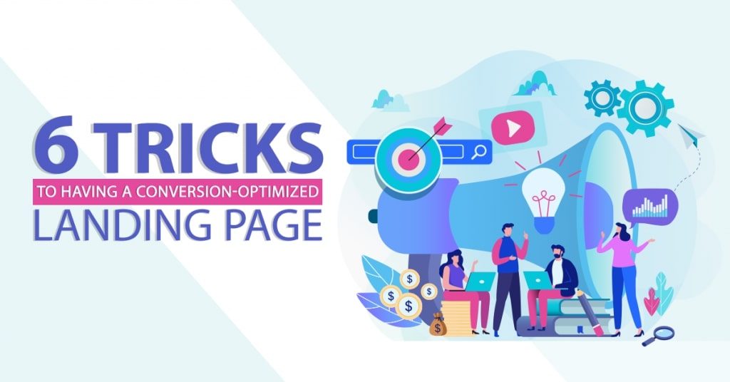
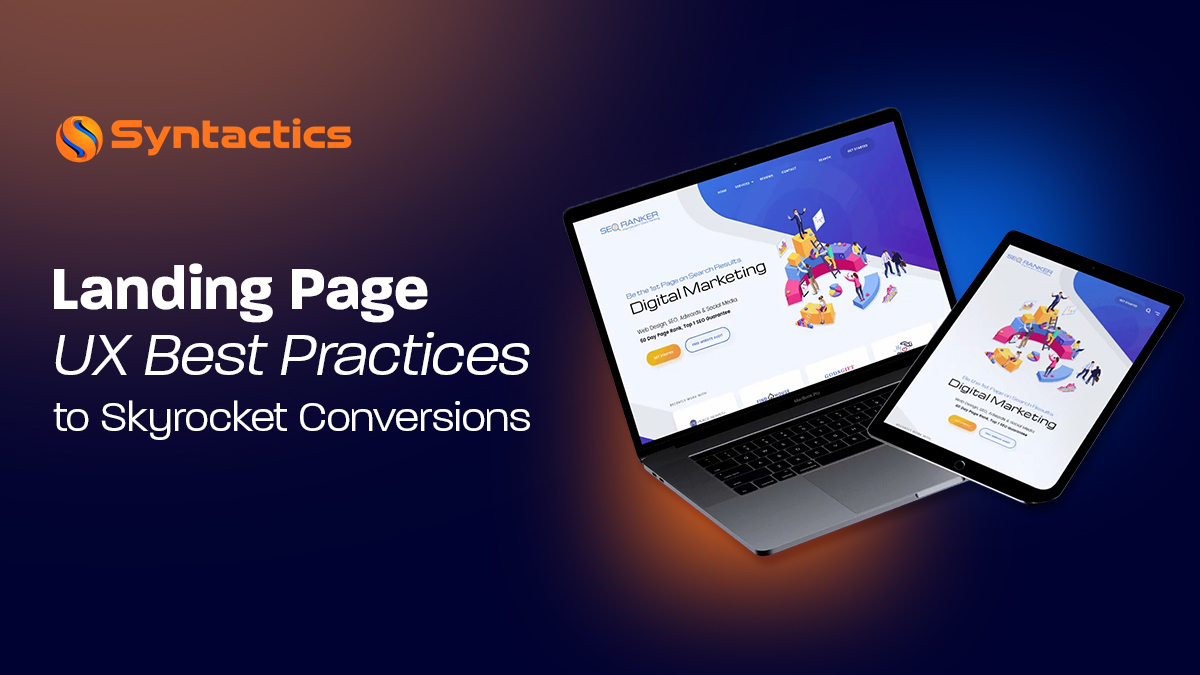
6 Tricks to Having a Conversion-Optimized Landing Page
The trickiest part of marketing is getting conversions from your effective landing pages. Turning a lead into a sale is not as simple as putting up a random landing page design and instantly expecting profit.
If your marketing strategy has focused solely on gaining traffic and lead generation, that is only the beginning. Of course, no one can dismiss the importance of getting traffic and leads; but would it not be better if that traffic ended paying you for your offer?
Some people would say getting more traffic means more chances of getting leads and thus, conversions. However, there are thousands of prospects and only a small percentage is going to fill up that contact form. An even lower percentage is then going to end up buying your offer.
Let us address the possibilities of getting more conversions by starting with the root of it all – your effective landing page.
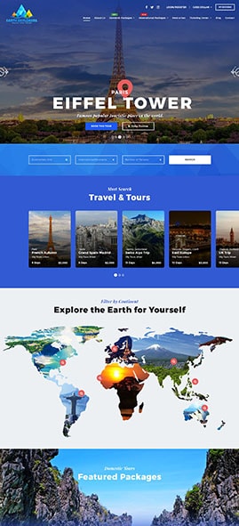
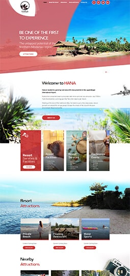
How to Have a Conversion-Optimized Landing Page
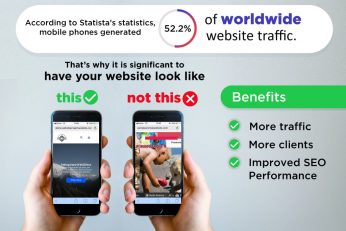
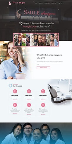
 Source: Landing Page Optimization: Best Practices, Tips and Tools (2018), Crazy Egg.
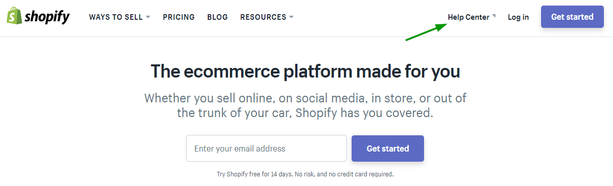
#1 Make the Design Simple
When you are selling, sometimes the first thing you end up doing is going all out with your marketing page. You might be doing all you can to make your page extraordinary, incorporating different sorts of design elements.
However, what you might end up doing is distracting your users from keeping their eyes on the prize. A simple design where your Call-to-Action is the center of attention will be enough to prompt conversions for your page.
#2 Your CTA Should be Crystal Clear
The CTA or Call-to-Action is what you want users to do the moment they get on your page. Some common examples of CTAs are sign-ups to newsletters/demos, availing a promo on a service or product, contacting you, etc.
Make sure this CTA is as tempting as possible for users to click; visual cues like arrows can also help. Additionally, make sure you are focusing on one CTA to further boost landing page conversions, so you do not confuse users.
#3 Personalize Your Landing Page Design
Since landing pages are often used to target a particular audience, designing your page according to the style of such audience will help with conversions. This goes hand-in-hand with using data metrics from previous ads to determine the demographics of people who are most likely to be your target audience.
For example, for wedding photographers, they might want to run pages tested towards soon-to-be brides and grooms. A bridal landing page would have feminine undertones, with soft colors. In comparison, a groom-targeted landing page will be mostly minimalist and solid colors.
#4 Write User-Centered Content
While the end goal is being able to convince a user enough to buy something or do whatever it is you want them to do, do not turn your landing page into a cliché salesperson. The truth is, people do not want to hear you go on and on about how great your offer is.
In marketing, what matters to them is how your product/service is going to affect and benefit their day-to-day lives. Study and tackle pain points in your audience where your product/service is the solution. Lastly, try and appeal to strong emotions, both negative (ex. Frustration, fear, etc.) and positive (happiness, excitement, etc.). That way, you are more likely to get landing page conversions.
#5 Use a Contrasting Color Theme
Sometimes two colors are all it takes to create a landing page that stands out and converts. Colors that directly contrast each other offer many opportunities to highlight important information and CTAs in your landing page.
You do not necessarily have to use the color wheel to find the strict contrast for the main color you want to use on your landing page. A simple light and dark contrast can already be enough to bring out a converting landing page.
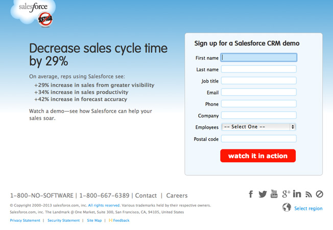
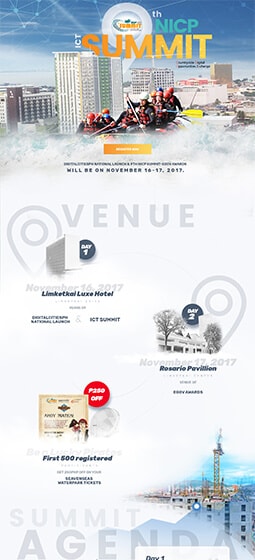
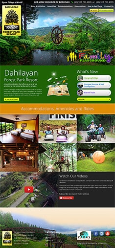
Source: How to Make a Landing Page That C.O.N.V.E.R.T.S., Neil Patel.
#6 Important Things Go “Above the Fold”
Last, but not the least, is to remember to keep everything important Above the Fold. This means making sure a catchy headline, and more importantly, your CTA is visible the moment a user opens your landing page.
This worked with newspapers whose leading stories and headlines were always displayed right above where people would usually fold it to stack it on newspaper stands. The same thing goes for a landing page design, where further details can be read by scrolling down, but the essentials you can already see upon opening.
Landing Pages and Digital Marketing Ads
You spend money when you run ads, and if those ads do not appear to be getting you the results you want it can be a big let down. Thus, make sure your landing pages have been designed and optimized accordingly to build up the chances for conversions, so your ads do not go to waste.
Do not just stop at simply creating a page and running the ads too, test them out against different variations though A/B testing to find out which works better. That way your ads keep growing and get better each time.
About Axel May Rivera
Axel is an avid fan of many dramas and songs. She is always eager to explore and discover more when it comes to movies and entertainment, especially in Korean and Filipino culture. In her free time, she enjoys reading books and playing badminton.

Related News:

Get To Know Yahoo’s New Advertising Platform


Full Stack Developer Skills Checklist


Comment 0