The 7 Principles of Conversion Centered Design
You have probably heard of and tried many web design trends to build an interactive, responsive, and professional-looking business website. Web design aims to create websites that are aesthetically pleasing and functional, while driving customer conversion and increasing ROI.
In this article, we delve into the principles of conversion-centered design and their role in building websites.
The Concept of Conversion Centered Design
Conversion Centered Design (CCD) is a design methodology that uses psychological principles to guide website visitors toward a single, intended action. It applies visual hierarchy, behavioral cues, and persuasion techniques to increase conversions on landing pages and product pages.
Through CCD, business website owners guide visitors to complete a purchase or transaction. In this way, they turn a site visitor into one of their customers. The approach works by reducing friction and directing attention. Instead of letting visitors wander, CCD creates a clear path from arrival to action.
CCD is best applied on your website’s landing page. Landing pages are entry points for your target market, which is the first thing your audience sees when opening your site. Digital marketers create conversion-optimized landing and product pages and use call-to-action (CTA) buttons to address customer goals and improve SEO.
For a deeper dive, see our guide on landing page UX best practices.

The Principles of Conversion-Centered Design
Through conversion-centered design, you can help drive customer conversion rates and support your digital marketing success. Below, we discuss each principle and how it creates a web design that improves customer conversion.
Encapsulation
Also called the “tunnel vision effect,” encapsulation works because of how the eye naturally behaves. When looking into a tunnel or a framed subject, the eye moves directly toward the center. It does not wander unless another element pulls it away.
Apply this principle to make your CTAs the focal point of the page. Use strong colors and dynamic shapes to frame the CTA. The visitor’s attention goes where the frame directs it, with nothing competing for that focus.
Contrast and Color
Colors produce different emotional responses. There are color groups associated with warm, cool, and neutral emotions. To make specific parts of your website stand out, use contrasting colors.
Study the color wheel and identify colors that sit opposite each other. Applying contrast to your CTA button makes it stand out without requiring the visitor to search for it. Contrast is both a design choice and a functional signal.
Directional Cues
Visitors do not always know where to go next when they land on a page. Directional cues solve that. These are visual elements: arrows, animations, shapes, or even a person’s gaze in a photo, that guide the visitor’s eye toward the intended action.
Use simple shapes, animation, and other elements that point toward a specific part of your website. Directional cues work because people follow visual signals instinctively. The principle closes the gap between a visitor arriving on your page and taking the action you want.
White Space
Also called “blank space,” white space is the absence of content around a key element. Used correctly, it eliminates visual competition and directs attention to what matters most.
In this technique, everything else on the page recedes, leaving your CTA or headline as the primary visual anchor. When the visitor’s eye has nowhere else to go, the desired action becomes the obvious next step, whether that’s making a purchase, booking an appointment, or signing up for a service.
Urgency and Scarcity
People act faster when they believe an opportunity is limited. CTAs like “Limited seats,” “Order before [date],” and “Offer only lasts until [time]” activate a psychological response tied to loss aversion. They may sound familiar, but they work because they tap into a genuine motivator.
Apply this principle with honest, specific limits. Manufactured urgency erodes trust quickly. Real deadlines, actual stock counts, and genuine limited offers produce better results over the long term.
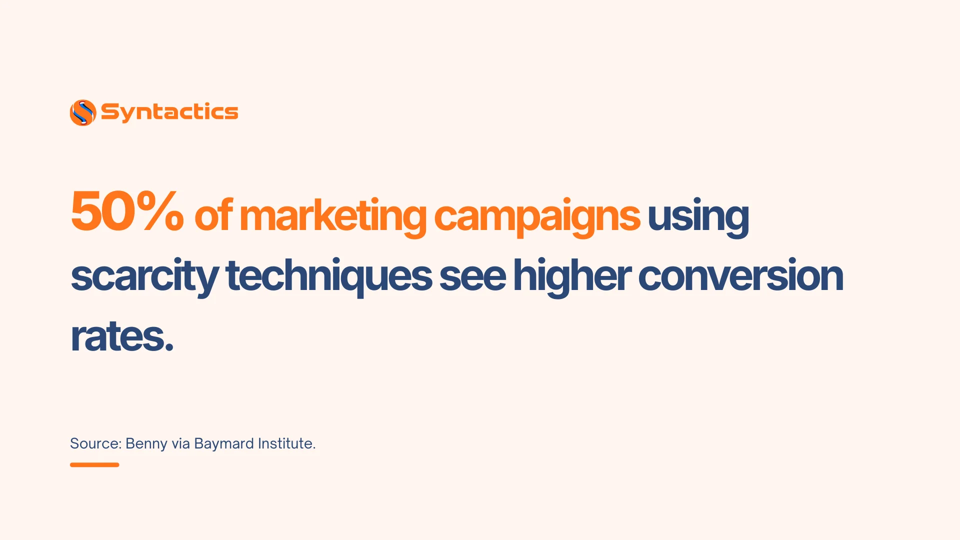
Source: Benny via Baymard Institute.
Try Before You Buy
Transparency reduces purchase hesitation. When you promote your products and services openly, your customers see your business as a credible provider. Hiding product details or limitations creates doubt; removing that friction builds confidence.
For software, this means offering a free trial. For services, it can mean a free consultation, a sample report, or a demo. Visitors who can evaluate your product before committing are more likely to convert and stay as customers afterward.
Social Proof
Let your target audience see that other people are already choosing your product or service. Social proof, such as reviews, testimonials, case studies, usage statistics, and share counts, signals that the decision to convert is low-risk.
You can amplify this through a social media marketing and SEO combination, showcasing your brand and expanding your reach. Show your market how many times your site, products, and services have been liked, shared, or reviewed. Social proof answers the question most visitors never voice: “Has this worked for someone like me?”
Increase Conversion Rates with Conversion Centered Design
By applying these principles of conversion centered design, you can build a business website that looks good, drives traffic, increases conversion, and delivers strong customer satisfaction. Each principle addresses a specific point in the visitor’s decision-making process. Applied across your landing and product pages, they make the path from visitor to customer shorter and clearer.
Build and maintain a high-converting business website by partnering with an experienced web design company in the Philippines.
Get Design and Functionality
Specific to your Brand!
- Build a website that's mobile-friendly and responsive.
- Custom designs aligned with your brand.
- Optimized for SEO and user experience.
- Scalable and feature-rich solutions.

This article was updated on May 4, 2026.
Frequently Asked Questions
What is the difference between Conversion Centered Design and UX design?
UX design addresses the full user experience and usability of a product or website. CCD is a focused subset of that, concerned specifically with driving a single conversion action. UX considers the entire user journey; CCD zeroes in on the moment of decision and removes whatever stands in the way.
Can small businesses apply Conversion Centered Design?
Yes. CCD does not require a large budget or a full redesign. Simple changes, such as adding contrast to a CTA button, reducing clutter around a form, or adding one customer testimonial, all apply CCD principles. Start with one principle per page and test the impact before layering in more.
Contact our web experts for a tailored quotation.
Is Conversion Centered Design only for landing pages?
Landing pages are the most common application, but CCD principles apply to any page where you want visitors to take a specific action. Product pages, pricing pages, contact forms, and blog posts with embedded CTAs all benefit from CCD techniques.

About Xenia Labis
Related News:


The Importance of Content Updates in Website SEO

Restaurant Management Software for Your Business