

Why You Need to Jump on the Mobile Optimization Horse Right Now
There is no denying the fact that the internet and technology have modern day civilization obsessed. Millions or even billions of people go online to check their social networking sites or surf the net everyday. It has also become even more prevalent with the release of smartphones. There is now a rapid and continuously growing popularity of smartphones. Thus, more and more users are surfing the net through their mobile phones. Laptops or desktop computers are no longer the only devices for surfing the net. Of course, for website owners that only means one thing – a mobile-friendly site!
Reasons Why a Mobile Friendly Site Is Important
Before the boom of smartphones, you have probably heard the overused phrase “businesses need to have their own website!” Now with the popularity of mobile devices and surfing the net on such devices, you will hear it is more than just about getting a website. It is now also about getting a mobile-friendly site.
If you want to know the importance of mobile optimized or mobile-friendly websites, check the list of reasons by Jacob McMillen of Treehouse below.
10 Reasons Your Website Needs to be Mobile Optimized
- Everyone’s on mobile – It is as simple as that.
- Over half of web traffic is mobile – Since everyone is on mobile, it only follows that a majority of website traffic will indeed come from mobile phones.
- Mobile users behave differently – These people tend to be more visual in nature. They focus mainly on videos and images rather than blocks of content.
- Mobile users buy more – When they see an affordable item that is just a tap away, there is no stopping them from making the purchase. Unless of course, your website makes it hard to do so since it is not mobile-friendly.
- Mobile users switch screens – If they are not making purchases on their mobile, they can easily switch to the desktop computer to complete the transaction.
- Mobile landing pages require different strategies – According to McMillen, “mobile screens cannot handle the same style of presentation you would employ on a full desktop screen.”
- Google favors mobile responsiveness – Google has a soft spot for mobile-friendly websites, so when yours is mobile-friendly, you are more likely to rank higher than non-mobile friendly websites.
- Social media referrals are on mobile – “Social activities use 91% of mobile internet access.” McMillen states. If mobile users find your social media business page, they are more likely to find your website.
- Great mobile sites differentiate your brand – Mobile optimized sites stand out among several not optimized business websites.
- Mobile advertising is still underutilized – If more people are browsing the net on their mobile devices, it only makes sense to start using mobile ads to get their attention. Go where the crowd goes, and you can generate not just more traffic, but more leads as well.
Mobile Optimization Statistics
If that is not enough to convince you about the importance of mobile optimization, here are more convincing statistics:
- Since smartphones are so portable, you can easily bring them to the bathroom for browsing. This is actually a good thing. According to Unbounce, “iPhone users are 12% more likely to make a purchase while sitting on the porcelain throne.”
- “70% of consumers tend to immediately delete any email that does not render well on a mobile device.” (Source: 15 Stats That Prove You Need Mobile Email Optimization)
- People have a better perception of your business if you have a mobile optimized or mobile-friendly site. In fact, “61% of people have a better opinion of brands when they offer a good mobile experience.” – Mobify.
- “50% of all local searches are done via a mobile device as their primary method of searching online.” (Source: 6 Stats To Convince Your Manager to Invest in Mobile Optimization)
- Prominently, according to Higher Visibility: “Nearly half of consumers say they will not return to a website if it does not load properly on their mobile devices.”
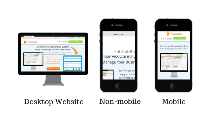
Traits of Non-Mobile Optimized Websites and How to Test a Website’s Mobile Friendliness
If you came across a website on your mobile phone that gave you more of a headache just going through it, then it is obviously not mobile friendly. Websites that are in fact mobile friendly are supposed to make web surfing an easy and enjoyable experience for users.
To give you a more visual illustration of a non-mobile friendly website and a mobile-friendly site, here are some examples:
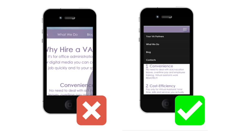

Three Most Common Traits of Non-mobile Friendly Websites
- Blocks of content that is too small to read
- Images are also too small or even cut out of the screen
- The whole screen which would fit perfectly on a desktop is too big to fit on the mobile screen. This makes users not just scroll up and down, but move the page sideways to read everything.
All in all, a non-mobile friendly site is not even the least bit enticing for online users. It is a flat out turn off. Thus, it may be the main reason behind high bounce rates. If you take a look at the mobile-friendly counterparts in the pictures, you’ll see the opposite of the traits above.
- Content that is presented in a neat and readable way
- Appropriately sized images users can actually appreciate
- A perfectly fit screen on your mobile phone
Generally, mobile-friendly sites make life easier for mobile users. It is also easier for them to digest information about your business. This could eventually lead to a conversion. Now, you might be wondering how to test your own website for mobile friendliness. Fortunately, there are a good number of tools you can use to test such website trait.
Probably the most popular one is a tool by none other than Google, which you can check out here: Mobile-Friendly Test.
If you want to test if your website is iPhone 4 friendly, you can use this tool: iPhone Simulator.
For other mobile devices, this can come in pretty handy as well: MobileTest.me.
There are several other tools you can try and check out for your website. But sometimes you have to actually test it on a live mobile device to really find accurate results.
Mobile Friendly and SEO Ready
You are one step closer to achieving the top spot on the search engine results page once you have a mobile friendly or mobile optimized website. That being said, it is time to get mobile optimized!
About Jalou Batilong
Most every great writer is a voracious reader, and no word describes Jalou better. Jalou enjoys a good read whenever she has the time to sit down and open a book or browse for interesting articles. It's through reading that she is able to digest information so easily, and write her own unique piece of information to share to everyone else.
- Find more about me on:


About Jalou Batilong
-
Find more about me on:
Comment 1
1 Comments
Leave a comment
Related News:


6 Easy Ways to Set Up Ads on LinkedIn


Niharika
Interesting and informative post. To market your business and develop it by making it more and more accessible, making a website that is mobile-friendly first and the foremost way to do it.