5 Key Points To Remember When Creating Great App User Interface Designs
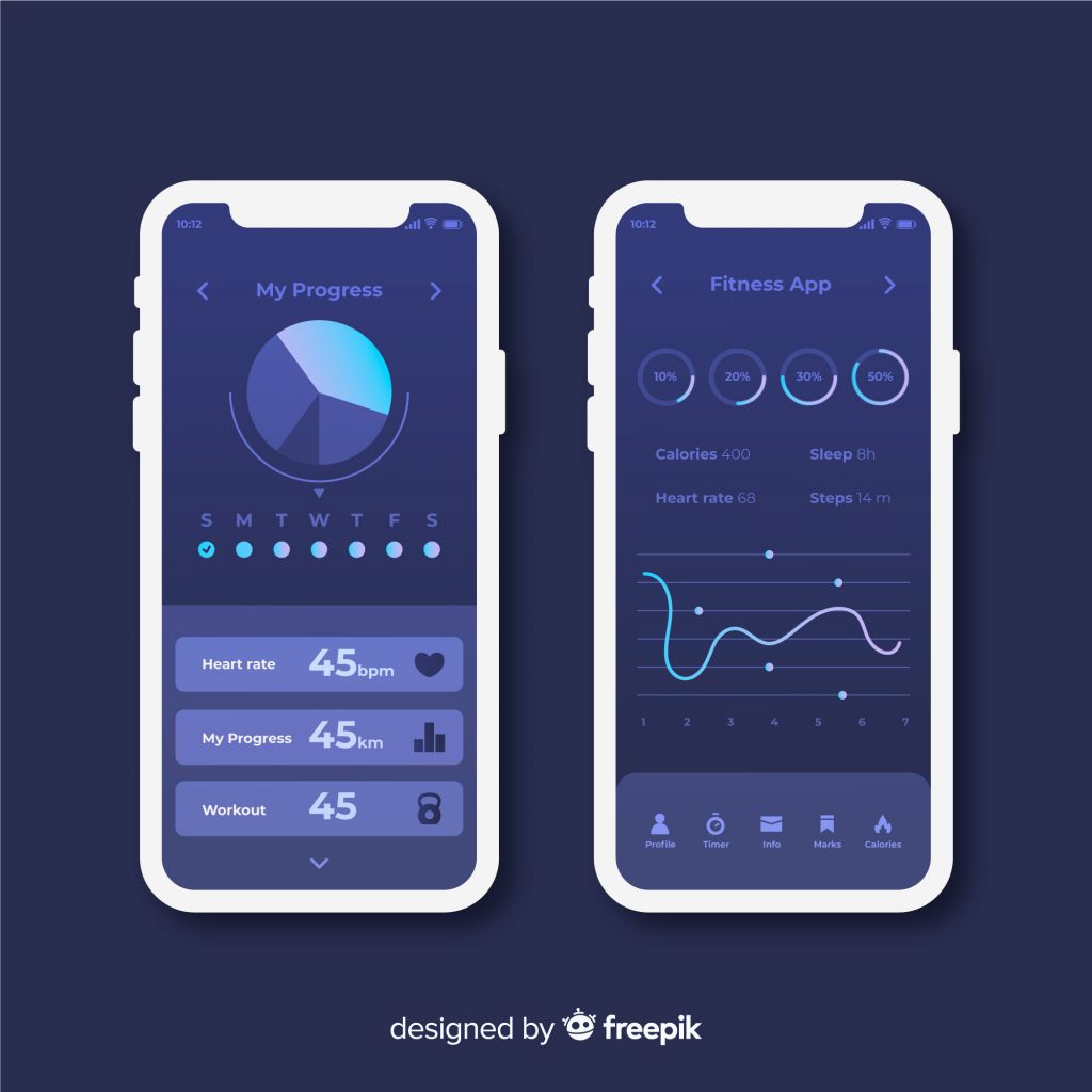
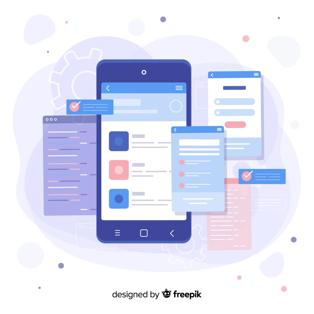
An app’s user interface design draws the users in and retains their attention. Having a good app design lets your audience know that you have a firm grasp on your company’s branding, style, and standard. More importantly, it allows them to maximize their interaction with you as consumers.
Wondering how to create a great user interface design for your app? Here are 5 tips to get you started:
App User Interface Designs Follow Basic Design Principles
When you create a User Interface (UI) for an app, keep in mind that it should follow basic graphic design principles. For example, pick a color palette that complements your logo. Keep in mind that you’ll need a second color palette when you provide users with an option to switch to Dark Mode. Associate certain colors for sending confirmation signals, error messages, and your Call to Action (CTA) buttons. Set your interactive elements to another color to make them stand out. When it’s time to test your apps, use them under different lighting conditions. Be sure to address any significant differences you encounter when you use it outdoors as well.
Moreover, mobile applications are displayed on devices with smaller screens. Using fingers to tap on buttons doesn’t provide the same precision of using a mouse and its cursor on a computer. This means that ideally, your buttons and CTAs should be big and evenly-spaced enough. This way, you can prevent your users from tapping on one instead of the other.
Other examples also include having a thorough understanding on the purpose of establishing balance, proximity, and negative space.
Execute Ideas That Conform To UX Principles
Oftentimes, app user interface design is part of a much larger goal: providing the best User Experience (UX) you can offer. Thus, your designs should conform to basic UX design dos and don’ts and principles as well. To start, study design trends that receive good reviews because of their intuitive designs. While it’s recommended to let your style and branding take over to stand out and be unique, don’t overdo it. Look out for simple details that might mislead your objects like mismatched icons, images with the wrong captions, and dead links. This is also applicable to functions that aren’t necessarily performed through buttons, such as pinch-to-zoom, double tapping, and scrolling.
Establish A Visual Hierarchy
Designers need to segregate the app’s content into different segments. This is why having the appropriate menus, categories, and subcategories, among others, is crucial. When designing apps that are text-heavy, focus on readability. This way, your app user interface design can clearly convey the message you want to get across. Usually, more important elements are either isolated or made bigger to give them more importance. While it may be tempting to emphasize everything, highlighting too many words, topics, or ideas can actually have the opposite effect. Doing so may confuse your users—so stick to emphasizing only those with the highest priority.
Set subheadings and other supporting details to a slightly smaller font size that’s still slightly bigger than your body text. Finally, choose a standard font size for the remaining majority of your text. However, avoid making any of your text too small. When your content isn’t easily readable, your readers may not put in the effort to read it at all.
Provide Consistency
Similar to designing visually appealing websites, mobile apps should stay consistent. While drafting them, take into consideration that your app’s user interface design should be able to adapt to the different kinds of pages you’ll use. There’s no problem with modifying it to better fit some pages, but don’t stray too far from your original design. Limit and place your content to specific areas. Additionally, keep your image’s aspect ratio regardless of screen orientation to prevent distortion.
Follow A Specific Alignment
An app needs to be able to present all of its elements in an organized manner. Furthermore, it should be able to accommodate users on both portrait and landscape screen orientations. Therefore, grouping and aligning certain elements relies more on just your visual preference. When designing apps for a specific target market, consider the default language of their country. Which direction do they read from? This can help you identify choose between aligning elements to the left or right of your app. Moreover, group elements together to help you establish the connection between them, keep the interface clutter free, and maximize discoverability. Finally, place margins on each side to avoid elements from overlapping with your menus, navigation bars, and status icons.
Are You Designing An App’s User Interface?
In addition to making app user interface designs that will satisfy your users’ expectations, you also need to provide equally engaging content and visuals. After all, when your target market doesn’t like what your application provides, they won’t continue using it. Worse, they may even uninstall it. Appeal to their tastes with customized illustrations from a professional Filipino graphic designer!


Comment 0