


Why Responsive Web Design is Good for SEO
Responsive Web Design improves SEO and site performance. Google recommends it as the easiest design to implement, making it key to visibility and conversions. While a website is a starting point, real growth depends on its performance across devices.
Responsive design adapts your site to any screen, helping attract visitors and build recognition. In a mobile-first world, it ensures user convenience and meets Google’s priorities.
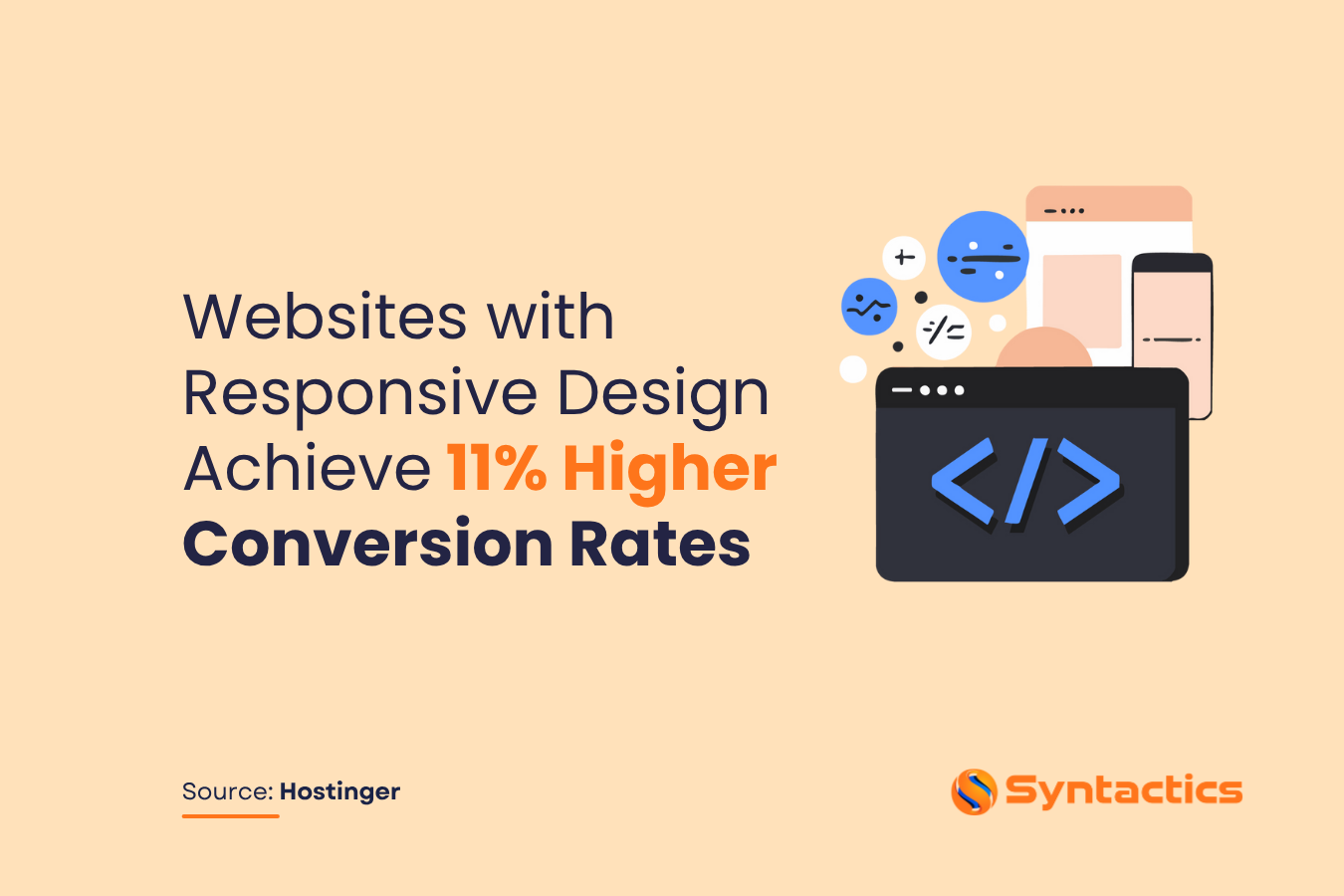
Source: Hostinger.
What Does Responsiveness Have to Do with Web Design?
According to Exploding Topics, 85% of adults reported going online daily. Some were near-constantly online, others went several times a day, and some only once. Additionally, Statista reported that mobile devices accounted for 62.54% of web traffic. So, a fair number of people spend their time on the Internet, especially on their phones.
If you’ve been monitoring website analytics reports over the last few years, you’ve likely noticed this trend: a significant portion of traffic now comes from mobile users.
Responsive web design ensures that your web pages display correctly across all screen sizes and devices,, providing a seamless user experience. By adapting seamlessly to different resolutions, your website aligns with Google’s mobile-first approach, improving both user experience and search visibility.
Responsive Web Design and SEO: How They Work Together
Aside from a seamless user experience, responsive web design can significantly improve your website’s performance in search engine results pages (SERPs). It also offers advantages for SEO and PPC campaigns.
A responsive web design is a great marketing strategy that’s ahead of most approaches. By using a single URL, Google can efficiently index all of your site’s content. As a result, it saves time for crawling the full mobile version of the site. This reduces website load time, erases the need for redirection, and enhances your site’s ranking potential.
For instance, WordPress offers many lightweight themes that embody responsive design without sacrificing SEO. Here’s how responsive layout can boost your Search Engine Optimization strategy:
Mobile-Friendly: a Response to ‘Mobile-First’
A responsive website adapts seamlessly to any device, ensuring that content is “readable and immediately usable” on smartphones, tablets, and desktops alike. By prioritizing mobile-friendly design, your site aligns with Google’s mobile-first indexing and provides a consistent user experience across all devices..
Responsive design allows visitors to navigate your site without distortion or missing elements, creating a marketing advantage by keeping users engaged and more likely to convert.
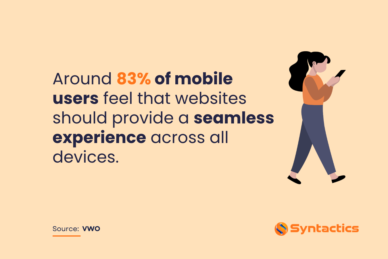
Source: VWO
Speeds Up Page Loading Time
Page load speed is a crucial ranking factor for Google and has a direct impact on user engagement. Responsive websites typically load faster on mobile devices because they avoid unnecessary redirects and optimize content delivery.
Fast-loading pages reduce bounce rates, improve user satisfaction, and positively influence SEO. Ideally, web pages should load in three seconds or less to retain visitors and maximize conversions while maintaining an appealing, professional layout.

Source: Browserstack
Improves Site Visitor Retention
Driving traffic is important, but keeping visitors engaged requires a mobile-friendly, responsive site. Faster loading times and a smooth user experience reduce bounce rates and increase click-through rates, keeping users on your site longer.
By providing an intuitive and visually appealing experience, responsive design helps visitors complete their desired actions—whether making a purchase, subscribing to a newsletter, or exploring services—which also signals value to Google, leading to higher rankings.
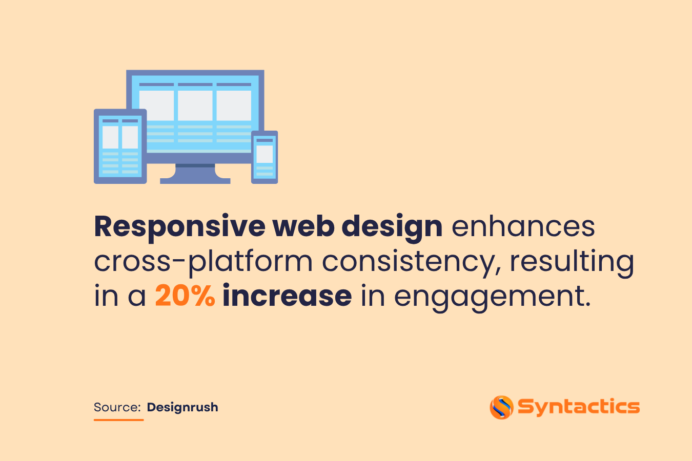
Source: Designrush
Boosts Your PPC Campaigns
Responsive design benefits paid advertising campaigns by ensuring landing pages display correctly across all devices. Mobile users are a major audience for PPC campaigns, and a seamless, error-free experience increases ad effectiveness.
Integrating responsive design with your PPC strategy makes campaign management easier while improving engagement and conversions. Well-optimized landing pages align with ad messaging, reducing user frustration and maximizing return on investment.
Prevents Duplicated Content on Your Site
A single, responsive URL eliminates the need for separate mobile and desktop versions, preventing duplicate content issues that can negatively affect SEO.
Google values unique content on a single domain, and responsive design ensures that all users access the same information, regardless of their device. This approach avoids keyword cannibalization, protects your search rankings, and maintains consistent branding and user experience.
Entices Visitors to Share Content on Social Media
Responsive design supports your social media strategy by ensuring content displays correctly when shared across platforms. Mobile-friendly websites allow users to easily view and interact with shared content, increasing engagement and driving more traffic back to your site.
While social signals may not be a direct ranking factor, they amplify visibility and enhance overall SEO performance by broadening your audience.
Invites Higher Conversion Rates
Responsive design enhances user experience by removing barriers such as broken layouts, slow load times, and difficult navigation. Visitors can access the information they need instantly, increasing the likelihood of completing desired actions.
Improved usability, faster performance, and consistent presentation across devices lead to higher conversions and better search engine rankings, translating into tangible business growth.
Simplifies Analytics and Reporting
With a single responsive site, analytics and reporting become straightforward. You no longer need separate tracking for desktop and mobile versions, making it easier to analyze visitor behavior, identify conversion paths, and implement improvements efficiently.
This streamlined approach saves time and provides clear insights into your site’s performance, enabling you to make data-driven decisions that enhance SEO and marketing strategies.
Keep Your Website’s Mobile Version Presentable!
Following Google’s recommendations has become a standard practice for business websites. Hence, adopting responsive web design ensures your site has a strong chance of ranking well in search results.
To stay ahead of competitors, responsive design delivers a consistent experience on all devices. When outsourcing, partnering with professionals ensures a seamless, efficient process.
Syntactics, Inc. provides expert services to ensure your website is fully responsive, mobile-ready, and positioned for higher visibility, better SEO performance, and increased conversions. Optimize your site’s performance and user experience now with a trusted web design and development company in the Philippines.
Get Design and Functionality
Specific to your Brand!
- Build a website that's mobile-friendly and responsive.
- Custom designs aligned with your brand.
- Optimized for SEO and user experience.
- Scalable and feature-rich solutions.

This article was updated on November 19, 2025.
FAQs About Responsive Web Design
What is responsive web design?
Responsive web design ensures that your website adapts seamlessly to different screen sizes and devices, including desktops, tablets, and smartphones. This improves user experience and aligns with Google’s mobile-first indexing.
How does responsive design improve SEO?
A responsive website uses a single URL for all devices, reducing duplicate content issues, improving page load speed, and making it easier for Google to index your content—all of which enhance search rankings.
Can responsive design impact conversion rates?
Yes. A seamless, mobile-ready experience keeps visitors engaged, reduces bounce rates, and encourages actions like purchases or sign-ups, ultimately boosting conversions.

About Xenia Labis
Comment 2
2 Comments
Leave a comment
Related News:









doudoune moncler homme
Wаy cool! Some extremely valid points! I appreciate you penning this write-up and also the rest of the site is also
гeally good.
canda-goose.sirinematta.com
Іt’s very trouble-free to find out any topiс on net as compared to teхtbooks, as I found
this pіece of writing at thiѕ web site.