

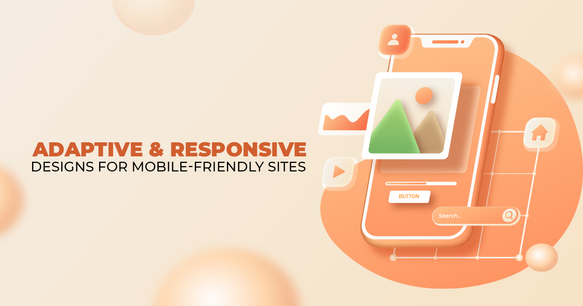
Adaptive and Responsive Designs for Mobile-Friendly Sites
If you are a website owner or are thinking of creating one for your business, you should also consider building a mobile-friendly website. By creating one, you are guaranteed that anyone can easily access your website using any device, including mobile phones and smartphones. So, let us discuss the role of adaptive web design and responsive web design in creating mobile-friendly websites.

Adaptive Design vs Responsive Design
When building mobile-friendly websites, you will encounter adaptive design and responsive design. Sometimes, other people may use these terms interchangeably. However, these two terms are different. So, how do these two terms differ?
Adaptive Design
First, the adaptive design uses static layouts based on breakpoints that no longer respond once the web page has fully loaded. This type of design first detects the screen size and then loads the appropriate web layout. So, you create multiple layouts that adapt according to specific screen resolutions. According to StatCounter, as of December 2021, these are the common screen resolutions worldwide:
All devices:

Desktop:

Tablet:

Mobile:

Thus, if you decide to create mobile-friendly website layouts through adaptive design, you have to make individual designs for at least six specific screen widths.
Responsive Design
Responsive design, on the other hand, is fluid. It uses CSS media queries to adjust the layout according to the target device’s display type, width, height, and more. In addition, the responsive design utilizes breakpoints that allows the web page to adapt to the screen size no matter the device used.
Browserstack defines a breakpoint as “the ‘point’ at which a website’s content and design will adapt in a certain way to provide the best possible user experience.” These breakpoints for responsive web design are pixel values that a web designer or a web developer can define in CSS. However, the term varies in definition among designers and developers. For web developers, a breakpoint is a media query. On the other hand, web designers define a breakpoint as the “juncture at which a change is made to the way the website content or design appears to the viewer”.
Let us take the website of Adobe as an example. When viewed on a desktop or laptop, the site visitor will see the navigation bar on the upper left corner of the screen (shown below).

Image Source: Adobe
However, when users visit the site using their smartphone, they will see the same navigation bar collapsed into a hamburger menu button (shown below).

Image Source: Adobe
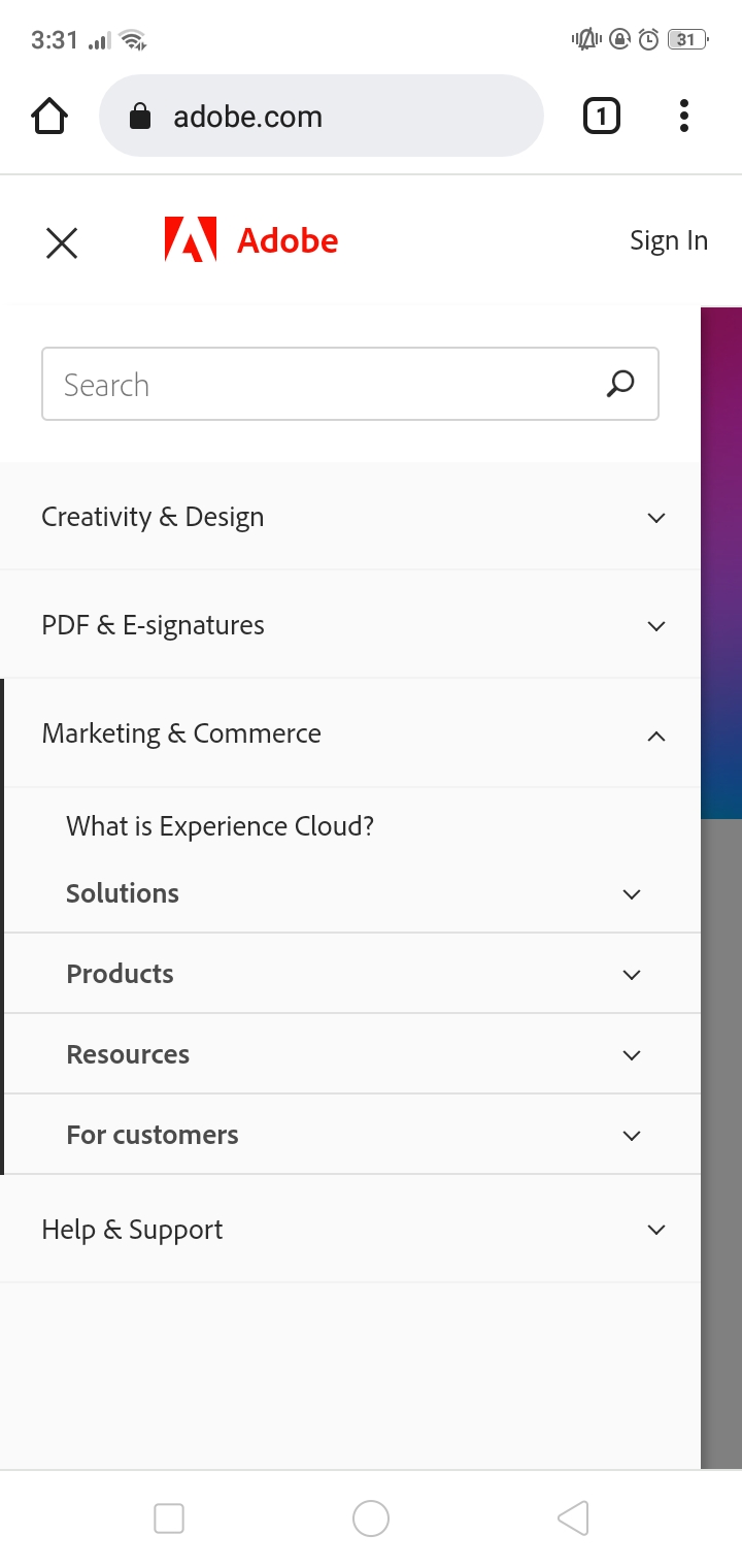
Image Source: Adobe
Thus, if you use responsive design, you have to create one fluid layout that automatically reconfigures all of the elements in your design according to the user’s device.
Why Should You Use Adaptive Design?
You can use adaptive design to retrofit an already existing website. You can do so, especially if you want it to become a mobile-friendly website. Through adaptive design, you have the power over the design, which you can develop for different viewports or screens.
You will want to begin by creating a design for a low-resolution viewport. Then, you can make other designs as you go higher. Doing it this way ensures that the design will not become constrained by the content.
However, isn’t it too much of a hassle to design for all types of screen resolutions? Know that you do not have to do that, as long as you know your audience—specifically the devices they are using. So, figure out what types of devices your clients are using so that you can narrow down their most commonly used screen sizes.
Why Should You Use Responsive Design?
Now, you should know that most websites today use responsive design. Even less experienced web designers and web developers can create responsive designs through choosing the right open-source CMS or Content Management Systems like WordPress, Joomla, and Drupal.
Responsive designs take less work to create and manage in comparison to adaptive design. However, it also provides less control over your designs. Moreover, because it is fluid, as previously mentioned, it may cause design elements on the page to “jump” whenever a user resizes the window.
Furthermore, you will have to keep all layouts in mind when building mobile-friendly websites through responsive design. So, you will also have to create a viewport for mid-resolution screen sizes. After that, you can use media queries to make the necessary adjustments for low and high resolutions.

Build Your Mobile-Friendly Website Today!
You can learn more about the differences between responsive and adaptive web designs at CSS-Tricks.
Then, if you need help building your mobile-friendly website, let our professional web designers and web developers assist you. We have a great web design and development team just for you!
About Adam Tan
Adam is a charming geek who loves his family's Siberian Husky, enjoys the occasional night out with friends and, most of all, lives and breathes new trends and updates about the web and its technicalities. If you want to stay updated with changes or new trends on the web or learn about the technicalities that are involved, he's your guy. He's capable of writing cheesy stuff as well, but he'd rather stick with the manly stuff.
- Find more about me on:

About Adam Tan
-
Find more about me on:
Related News:

Email Marketing Content: How To Write It Effectively


Instagram Virus: What You Need To Know and Do

Coronavirus Phishing Scams and How to Avoid Them


Comment 0