
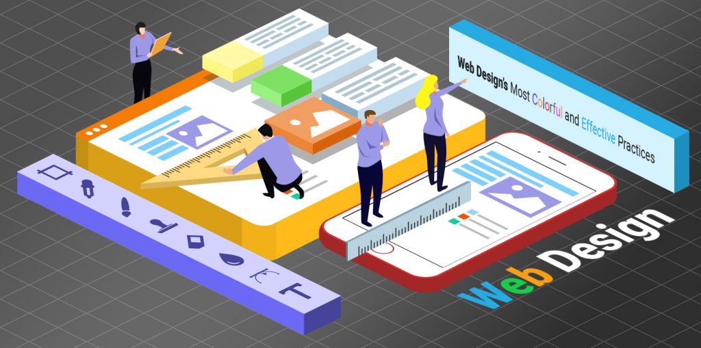
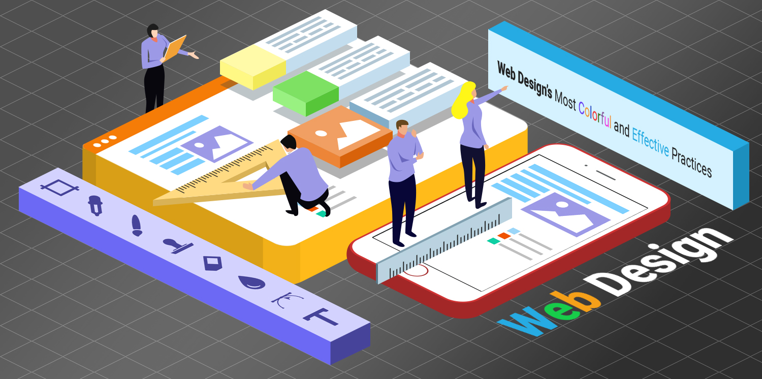
Web Design’s Most Colorful and Effective Practices
Design impacts both our offline and online everyday decisions. Visual creatures influence us even if we’re told not to judge books by their covers, we do so anyway. We especially become more critical when we view sites. Continue reading to find out what Designers do to satisfy the modern user’s needs and their preferred web design.
Responsive Web Design
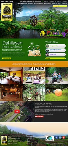
Designers usually adjust their layouts according to a screen’s display size, resolution, and pixel density. Nevertheless, what use is designing the perfect site if it’s only UX-compatible with one device? Maximize your resources by transitioning to the establishment of responsive websites that can adapt to any device’s display area.
In addition to having a good eye for web design, you have to know how to manipulate your current design to gain the most conversions. Use a few mathematical calculations to scale your images to the proper proportion to avoid wasting your high-quality visuals. You can also check some web design tools to improve the design workflow.
Optimized
Chances are, your site’s viewers ended up on your page because they’re looking for something. It could be that they want to scan product reviews, learn about your business, or need to avail of a service. When they become convinced by your search result’s preview after they look it up, designers won’t give them a reason to click away because of poor web design. They typically choose light, readable fonts that invite the viewer to read more.
Furthermore, be sure to meet their expectations. Don’t suggest that they click on a link if it’ll only redirect them to the Error 404 page. Though, in case of unavoidable circumstances, it’s best to have one custom-made for your site.
Your Audience’s Preferences
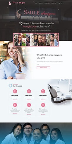
Engaging visuals naturally draw us in. However, our personal preferences differ and what we deem interesting may not necessarily be as attention-grabbing to another. Fortunately, the principles for creating a good web design, whether its User-Centered Design or Conversion Centered Design, still stand regardless of our differences.
With that being said, keep your target audience’s preferences in mind and fuse these with a few staple design principles. For example, utilize colors that complement and highlight your content – not distract from it. Consider experimenting with different palettes before selecting the best one. You might find yourself admiring a dark and minimalist theme, but if your business focuses on selling food, it might not do so well. In contrast, bright or pastel colors exude cheerfulness and entice them to place an order.
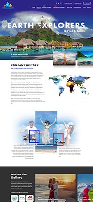
Group Elements Together
Web Designers don’t group elements for the sake of decoration alone. They’re fully aware that when users browse your web pages, these elements give new lives beyond their original editing software. They’re visually identified and categorized into groups based on their proximity, size, and similar characteristics.
To the user, grouping together implies that they provide similar functionalities. This unspoken communication method relays your message much clearer than plainly scattering bits and pieces of information everywhere.
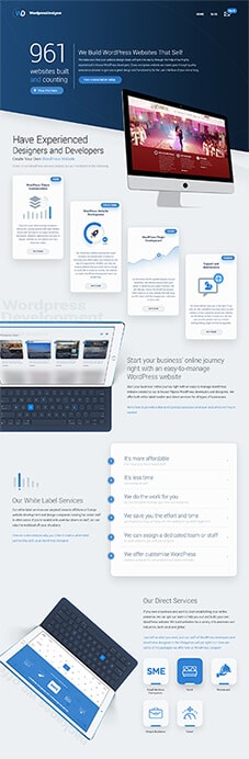
Blank Space
Also known as White or Negative Space, Designers actively incorporate Blank Spaces to break the page down into smaller, more manageable segments. They frame and emphasize your content, lead your viewers toward the grouped elements, and keep them feeling relaxed and comfortable.
More than simply being the spaces in between your sentences, they’re the margins that prevent your elements from sitting uncomfortably in your page’s edges and corners. They break the monotony of having wordy paragraphs after paragraphs and prevent your viewers from feeling like they’re drowning in unwanted details.
Intuitive
After browsing site after site, we’ve come to accept that having the business’ logo on the upper-left corner of the page is a standard. Pair this with our growing demand for sticky navigation menus, and you’ll have the baseline of an intuitive site.
Following its definition, intuitive sites must make usability the top priority. Let’s face it: most of us are busy; users would rather prefer to save time by bouncing off than figure out how to use inconvenient sites. When you stay useful and convenient, you retain their attention and remain relevant.
Visual Hierarchy
Achieving an effective visual hierarchy isn’t automatically synonymous to placing your elements into an organizational chart. Instead, Designers skillfully vary the elements’ size, alignment, and repetition to portray their importance. Generally, they upscale typographies and images they want viewed first to attract our eyes to its direction.
Plus, they understand that some of the site’s viewers quickly scan the page before proceeding to decide between consuming the content presented or clicking away. Therefore, ideally, sites conform to the most common reading patterns across cultures: going from the top to bottom and then from left to right. These patterns often translate into an F-shape for text-heavy pages and a Z-shape for those with giant promotional images.
Every website’s color palette, placement of elements, and working functionalities the competent artist brings would aim to take your site to greater heights.
About Adam Tan
Adam is a charming geek who loves his family's Siberian Husky, enjoys the occasional night out with friends and, most of all, lives and breathes new trends and updates about the web and its technicalities. If you want to stay updated with changes or new trends on the web or learn about the technicalities that are involved, he's your guy. He's capable of writing cheesy stuff as well, but he'd rather stick with the manly stuff.
- Find more about me on:

About Adam Tan
-
Find more about me on:
Comment 4
4 Comments
Leave a comment
Related News:
![[New] Syntactics - OMT - May - Visual Search & Tips for Optimizing Site Images (1)](https://www.syntacticsinc.com/wp-content/uploads/2023/05/New-Syntactics-OMT-May-Visual-Search-Tips-for-Optimizing-Site-Images-1-346x195.png)
Visual Search & Tips for Optimizing Site Images

Businesses Succeed with Top-notch Marketing

Outsource Web Developers: Dedicated vs Project-Based

Conversion Rate Optimization: Avoid These Mistakes


adsandurl
your post is really relevant for me and the way you tell us about Effective Practices is really outstanding
jerry john
Hi! I Hope you are good. I have to say this is an awesome post! Please help me I have some questions regarding web designing what should I do to increase the conversion rate on my landing page? Which software language is best for developing a website that can scale to over 100 million users? What is the best Word Press plugin for my newly launched website in 2019? How do I increase the page speed of my website?
Grip Infotech
This post really helpful. Thanks for sharing this post keep it up
Smith
Great useful tips. As we are newly started solar dealers firm in Sunshine Coast, we are planning to build a brand new website to promote our business online. Currently, we are looking to work with a leading web design agency in Sunshine Coast to have an excellent website which attracts our customers. Here I got awesome tips to implement in our design. Thanks for sharing.