

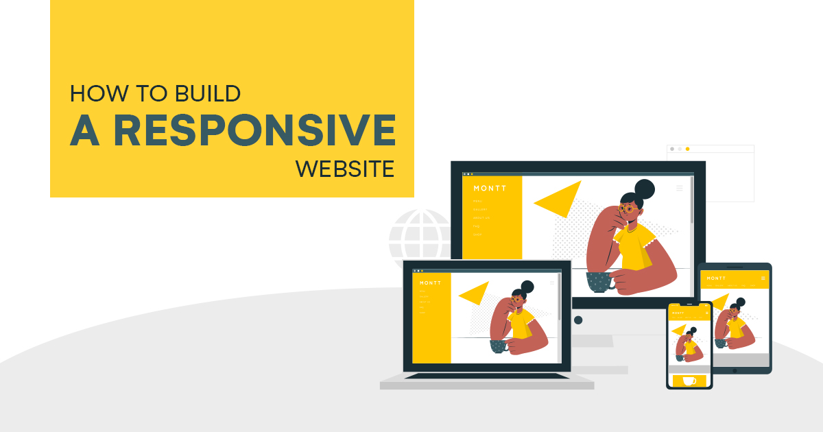
How to Build a Responsive Website
If you decide to build a website for your business, you should make sure that it is responsive to any device. Having a responsive website also guarantees that your users get a positive experience while browsing your pages. With this, your website can rank higher on search engine results pages (SERPs). Let us discuss the steps on how to build a responsive website.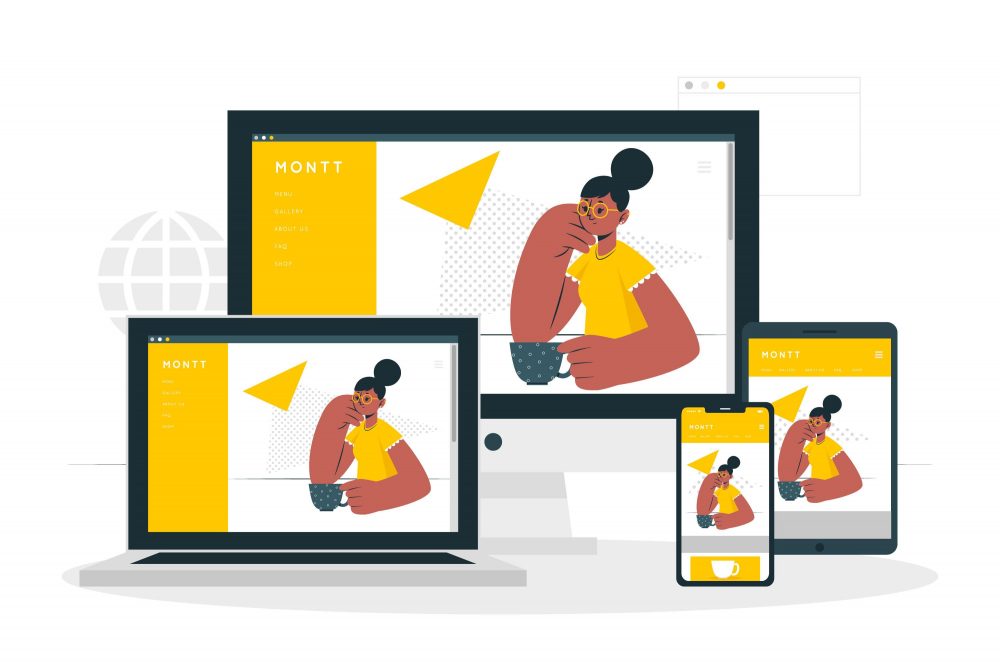
What is Responsive Website Design?
When we say responsive website design, this refers to the design strategy that allows web developers and designers to create a website that functions well on any device, including mobile, tablet, laptop, or desktop. If you have a responsive website, you ensure that all of your site visitors can access your pages without trouble.
As mentioned earlier, browsers also consider mobile-friendliness as one factor that affects the ranking of web pages. Therefore, considering that more and more people use their mobile devices to access the internet, the more reason you need to create a responsive website for your online business.
How to Build a Responsive Website
Today, professional web developers and designers are experts in creating responsive websites for their clients. So, if you are interested in creating your responsive website, here are the steps and methods that you can follow to do so.
ONE: Set Responsive Breakpoints
The breakpoint in responsive web design is the point or limit wherein the website’s content and design will adapt to provide site visitors with the best user experience. Because people access websites through devices with different screen sizes and resolutions, you should create a responsive website that renders well across various screens. When doing this, you should also ensure that you do not distort, cut out, or obscure content, especially images.
Web developers use responsive breakpoints (also called CSS breakpoints or media query breakpoints), which they define in the code. It is on these breakpoints that web content adjusts itself to so that you can display content accurately on the page. Thus, because of these breakpoints, your content will align itself according to the screen size.
Below are the most commonly used device screen resolutions worldwide as of July 2021 across all platforms (e.g., mobile, tablet, desktop, etc.):
- 1920 × 1080
- 1366 × 768
- 360 × 640
- 414 × 896
- 360 × 800
- 1536 × 864
TWO: Create Fluid Designs
Web developers today create websites according to a fluid grid instead of pixel measurements. A fluid grid places or positions web elements in proportion to the screen size from which it is displayed. It is divided into columns with scaled heights and widths not set to fixed dimensions.
As a result, web elements resize or respond to fit the screen size instead of adjusting to a specific size set in pixels. Thus, the proportion of web elements will depend on the size of the screen. So, with the use of a fluid grid, you can keep your responsive website’s aesthetics and feel consistent across all devices.
THREE: Consider Touchscreen Devices
Mobile devices today most often use the touchscreen feature. Along with keyboard functions, even laptops offer a touchscreen. For this reason, you should also consider said feature when building a responsive website.
Say you have a web page that displays a drop-down menu for your site visitors. You should ensure that each item or selection on your drop-down menu is large enough so that your site users can press on them using their fingertips. If you have a call-to-action (CTA) button, make sure that your site visitors have no trouble clicking on it without having to zoom in or zoom out on their screens.
So, if your web elements require being pressed on or touched, make sure that your site users can do it with ease. Also, optimize your web elements so that they render well on different screens and resolutions.
FOUR: Optimize Images and Videos
Another way to build a responsive website is to optimize your images and video content. For this, you can use the modern image tag attributes to ensure that your images are responsive to different device and screen resolutions. Then, when it comes to optimizing video content, you can employ an aspect ratio. Here are the common aspect ratios for screens:

Image Source: Adobe
FIVE: Optimize Typography
Web developers generally define font sizes using pixels. However, this will only work with static websites. What a responsive website needs are responsive fonts. As such, your font sizes should adjust according to the parent container width. In addition, it would be best if you had this to make your typography change following the screen size. In doing so, your site visitors can easily read your website’s text using any device.
Check this out:
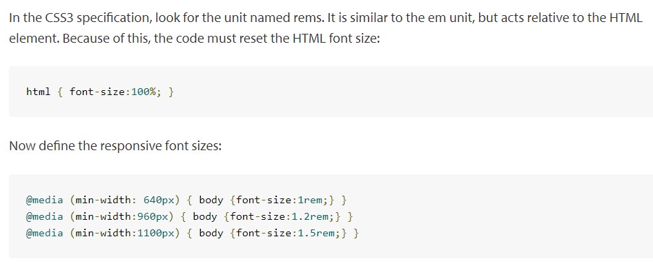
Image Source: Browserstack
BONUS: Use Pre-designed Themes or Layouts
If you are new to web development, you can find various website-building platforms online that allow you to create your responsive website using pre-designed themes and layouts with built-in responsive features and functionalities.
Once you have selected a theme or layout, you can begin customizing your web elements and pages. Through this, you can ensure that your web pages reflect your business’ colors, goals, and branding.
Let us Build a Responsive Website for You!
We hope the steps and methods mentioned above helped inspire you to build a responsive website for your business. So, if you need web developers and web designers to help you develop and customize your website, then look no more. You can seek assistance from a web design and development company from the Philippines to create that responsive website for you!
If you have questions about responsive websites, please feel free to share them in the comments section below!
About Adam Tan
Adam is a charming geek who loves his family's Siberian Husky, enjoys the occasional night out with friends and, most of all, lives and breathes new trends and updates about the web and its technicalities. If you want to stay updated with changes or new trends on the web or learn about the technicalities that are involved, he's your guy. He's capable of writing cheesy stuff as well, but he'd rather stick with the manly stuff.
- Find more about me on:

About Adam Tan
-
Find more about me on:
Related News:

Link Building Best Practices and Strategies

Using Google Trends in Marketing

Choosing The Best Web Hosting Plan For Your Website

Top 2024 eCommerce Website Design Trends

What are Business Applications or Software?


Comment 0