

How to Master Mobile-First Design for eCommerce Websites
Choosing the right web design for your eCommerce website is a pivotal decision. You’ll normally start with a desktop site layout before scaling it down to fit smaller screens. But with the growing number of smartphone users, you might want to consider a mobile-first design for your online store. When done right, it can improve customers’ shopping experience and increase sales.
If you want to know how to master mobile-first design, here are best practices a trusted web design agency would use to create a seamless online store.
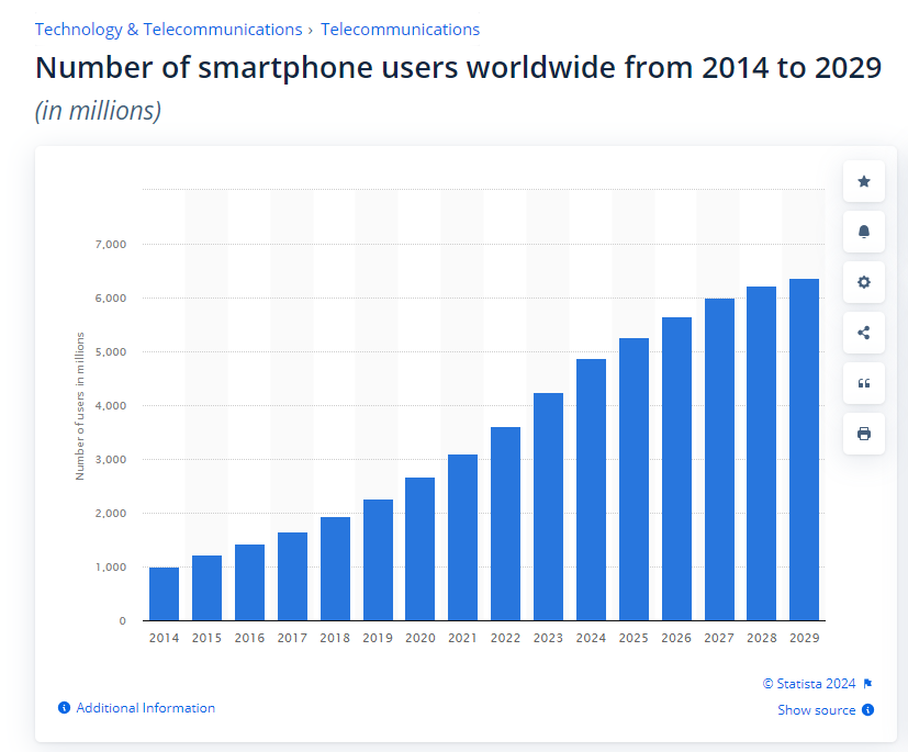
Source: Statista.
Understanding Mobile-First Design
In website development, developers will normally create a desktop layout before scaling it down to fit smaller screens on mobile devices.
The problem with this approach is that some web elements don’t adapt well to phone or tablet screens, affecting the quality of your mobile site.
Mobile-first design flips the approach by crafting a mobile website layout first before scaling it up for desktop screens.
Aside from creating a better-quality mobile site, the approach also caters to the needs and pain points of smartphone users.

Source: Exploding Topics.
After all, more than 55% of web traffic is from mobile devices. If customers enjoy using your site, there’s a bigger chance they’ll turn into loyal customers.
Additionally, a mobile-first web design can provide your online store with the following benefits:
- Higher conversion rates;
- Increased reach and accessibility;
- Enhanced brand reputation;
- Competitive advantage, and
- Improved Search Engine Optimization (SEO) performance.
How to Master Mobile-First Design for eCommerce Websites
Now you know what a mobile-first web design can do for your eCommerce business, here are some best practices developers can apply to create a superb site:
Conduct Research and Analysis
The first step to an excellent mobile-first web design is putting your users at the forefront. That’s why it’s best to conduct research to identify your target audience‘s needs. Careful analysis of customer data will make it easier to design a mobile web interface that fits your users’ needs.

Some steps for research and analysis include:
- Defining business objectives;
- Analyzing competitors’ mobile designs;
- Conducting user surveys, and
- Conducting usability testing.
If you already have an established responsive website, you can utilize Google Analytics to make data analysis more convenient. It lets you understand customer behavior by providing metrics like conversion rates, user demographics, and session duration.
Hence, you can use these insights to help an eCommerce developer further refine your web design.
Prioritize User Experience and Interface Design
If you want to create a seamless mobile-first web design, you can prioritize User Experience (UX) and User Interface (UI). UX covers how a customer experiences your website, while UI refers to the look and interactivity of your site.
Prioritizing the two can result in an attractive and functional website that customers will want to buy from.
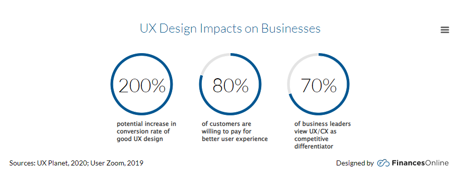
Source: Finances Online.
You can have a reliable eCommerce design agency prioritize UX and UI on your site by applying the following:
- Intuitive and user-friendly navigation;
- Visual hierarchy;
- Interactive media;
- Compelling Calls-to-Action buttons, and
- Mobile-friendly content.
Implement Responsive Design Techniques
Another best practice for an effective mobile-first layout is incorporating responsive design techniques. They let your website adapt flawlessly to different devices and browsers so customers can access it with no issues.
According to Useful User Experience Statistics, 80% of consumers will click off your site if it “doesn’t display correctly on their device.”
If your site’s text size isn’t optimized for mobile, shoppers will find it a hassle if they have to pinch to zoom every time they want to read product descriptions.
Also, let’s say a shopper switches from using your website on their laptop to their phone. If you have an unresponsive mobile site, they’ll likely find a cluttered interface, tiny texts, and hard-to-tap buttons.
Since these elements can make your website difficult to use, the user will click away out of frustration. Thus, you’ll lose a potential customer.
A responsive site adjusts to different screen sizes, so it will display a cleaner interface, readable fonts, and easy-to-press buttons for a smooth shopping experience.
Additionally, a professional web design agency can apply the following techniques to make your mobile site more responsive:
- Flexible grid layouts;
- Touch-friendly links and buttons, and
- Cross-browser compatibility.
Optimize Performance and Page Load Speed
For a flawless mobile-first web design, consider optimizing your website’s performance and page load speed. According to recent data, 45.4% of consumers are less likely to purchase from your business if your site loads slowly.
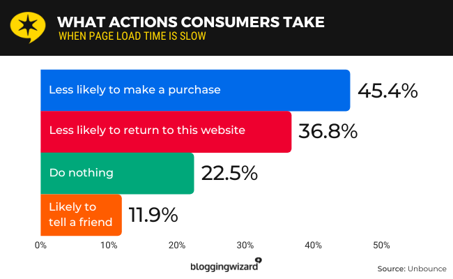
Source: Blogging Wizard.
Remember, not everyone has the time to wait for your mobile site to load completely. If your pages load at a snail’s pace, users will want to click off before they have the chance to view your products. Thus, it will negatively impact your revenue in the long run.
To prevent this, you can have a professional design agency optimize your site with these best practices:
- Compress images;
- Reduce Hypertext Transfer Protocol (HTTP) requests;
- Leverage browser caching, and
- Implement Accelerated Mobile Pages (AMP).
If you want to go the distance, you can use page speed optimization to unlock your eCommerce website’s potential. You can use Google PageSpeed Insights to track your mobile website’s performance metrics. It gives you recommendations on how to improve your site’s speed!
Streamline Checkout and Payment Processes
Your mobile website’s checkout and payment process can make or break your chances of making a sale. To prevent customers from abandoning their carts, eCommerce developers can make the process fast, simple, and secure.
An eCommerce web design agency can streamline your site’s checkout and payment process by:
- Integrating multiple payment gateways;
- Enabling one-click payments;
- Allowing guest checkout options, and
- Simplifying form fields.
Moreover, you can have a developer prioritize online payment security to enhance customer trust. Having ironclad security prevents cyber attacks like phishing scams and data breaches that can negatively impact your business’ reputation.
Testing and Iteration for Continuous Improvement
Before launching your mobile eCommerce site, it’s best to conduct Quality Assurance testing. It helps smooth out issues to ensure your website displays correctly on different devices and browsers.
After all, you don’t want customers to see your eCommerce site with missing images or too small fonts!
Here’s how a web Quality Assurance (QA) specialist can test your web design:
- Identify test goals and requirements.
- Develop a testing strategy plan.
- Select and set up testing tools.
- Ensure cross-browser compatibility.
- Conduct performance tests.
- Implement a better design strategy.
You can also have a developer conduct A/B testing to gauge how customers respond to your website’s pages and elements. They can then use the data to refine your mobile site’s UX and UI.
Addressing Common Challenges and Pitfalls
When considering a mobile-first design, it’s also best to consider its challenges. This way, you’ll know how to address them and prevent them from impacting your site’s effectiveness. Here are a few common mobile-first design challenges and solutions for an effective website:
Limited screen space.
To avoid running out of screen space, developers can prioritize essential features and utilize responsive design techniques. This way, users can still accomplish their goals on a mobile site that is neat and navigable.
Cross-device compatibility.
Mobile devices have different display sizes, so your website may not display correctly on all screens. Developers and QA testers can prevent this by conducting frequent testing to ensure your site displays consistently across devices.
Slower performance.
Smartphones often have slower processors compared to desktops, which can affect site performance. One trick to maintaining your site’s performance is to optimize it by implementing lazy loading or enabling caching.
Future Trends and Innovations in Mobile-First Design
There’s no denying that mobile use is shaping the future of website design.
If you want to keep catering to your customer’s needs, here are some key mobile design trends to watch out for:
- Faster loading speed and performance (i.e., minifying codes, optimizing images, etc.);
- One-click payments;
- Personalized push notifications;
- Interactive design elements;
- Tighter security, etc.

Which Mobile-First Best Practices Will You Use on Your eCommerce Website?
Choosing a mobile-first design for your eCommerce website can result in a myriad of benefits.
For instance, it addresses mobile users’ needs and pain points, so it’s easy to tailor your web design to enhance user experience and optimize performance. As a result, your customers can have a smooth shopping experience, which can positively impact business reputation and sales.
A professional eCommerce web design agency can apply various tips to craft a mobile website that contributes to business growth.
Frequently Asked Questions About eCommerce Website Design
What is an example of an eCommerce website?
One great example of an eCommerce website is the Warby Parker eyewear brand. Its website features a clean, user-friendly layout that showcases eyeglasses and sunglasses.
What makes a good eCommerce website design?
A good eCommerce web design is made of the following elements:
- User-centered navigation
- Responsive design
- Clear, high-quality images
- Compelling Call-to-Actions (CTAs)
- Trust signals (Customer reviews, testimonials, etc.)
- Fast loading times
- Detailed product descriptions
Which website builder is best for eCommerce?
The best eCommerce website builder can differ according to user needs. However, these are the top selections for many developers and business owners:
- Shopify
- Wix
- BigCommerce
- WooCommerce
- Squarespace
- Square Online
About Adam Tan
Adam is a charming geek who loves his family's Siberian Husky, enjoys the occasional night out with friends and, most of all, lives and breathes new trends and updates about the web and its technicalities. If you want to stay updated with changes or new trends on the web or learn about the technicalities that are involved, he's your guy. He's capable of writing cheesy stuff as well, but he'd rather stick with the manly stuff.
- Find more about me on:

About Adam Tan
-
Find more about me on:
Related News:

Know The Five Latest SEO Trends In 2012

Project Management Tools for Efficient Workflows


WordPress Custom Fields & How to Create Them


Comment 0